Results 1 to 12 of 12

Thread: J. Herbin Vert Olive

  1. #1
    Member carpedavid's Avatar
    Join Date
    Mar 2010
    Location
    Cleveland, OH
    Posts
    32
    Thanks
    0
    Thanked 57 Times in 20 Posts
    Rep Power
    0

    Default J. Herbin Vert Olive


    J. Herbin Vert Olive should be an ink that’s the color of olives, but it is not. Instead, it is the color of extra virgin olive oil – an ephemeral, translucent yellow-green – as backlit by a fluorescent light. One could also describe it as the color of Mountain Dew. Either way, it’s a color found somewhere in one’s kitchen. Its level of saturation is very low, but it does exhibit a very high degree of shading in both fine and wide nibs.

    Vert Olive is a very wet ink – akin to Vert Empire or Blue Myostosis. It flows well, of course, but tends to feather significantly on every paper I tested: it was most noticeable in my Ecosystem journal, which is a very absorbent paper, and least noticeable on Rhodia paper, which tends to be feather-resistant. Show-through was low on all papers, fortunately, and I noticed bleed-through only on the thin paper of a Moleskine cahier.

    Dry time is exceptionally fast. On Ecosystem, Rhodia, and Moleskine papers, Vert Olive was dry in less than three seconds. Consequently, writing on an incline seemed to produce no noticeable increase in drying time compared to writing flat for this ink.

    There are plenty of green inks that are suitable for business use, but Vert Olive isn’t one of them. I could see it being used for highlighting or possibly editing, but not for correspondence. It is difficult to read on both white and cream-colored paper; while it provides plenty of contrast, the color is so vibrant as to be tiring on the eyes.
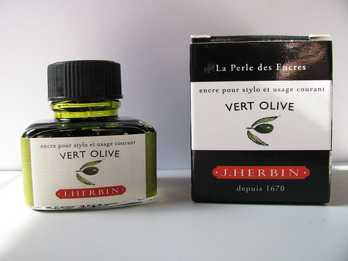


    All of J. Herbin’s fountain pen inks come in a 30ml bottle with an integrated pen rest that is suitable for displaying on top of one’s desk.

    While Vert Olive is a beautiful ink, due to its brilliant color I can only see using it for editing, highlighting, calligraphy, or other artistic endeavors.

    Note on the scan: on my computer screen, the scan is slightly brighter than the actual ink, but only slightly. It is a very vibrant ink.

    Review Materials: for this review, I used a Lamy 1.9mm steel calligraphy nib on a Lamy Joy pen for the wide strokes. The fine strokes were made using a Pelican M205 Demonstrator with a medium steel nib. The paper is Rhodia 80gsm. I also tested using a Moleskine cahier and an Ecosystem notebook.

    Read all of my ink reviews (and more) on my blog: seize the dave.
    seize the dave - a little bit about a lot of stuff: ink reviews, origami, poetry, and more
    my ink reviews
    follow me on twitter @carpedavid

  2. The Following 4 Users Say Thank You to carpedavid For This Useful Post:

    DrChumley (January 11th, 2014), inlovewithjournals (January 11th, 2014), Mesu (February 19th, 2014), VertOlive (January 25th, 2014)

  3. #2
    penspouse
    Guest

    Default

    Thanks for the review. For one who is not real fond of many greens, and seeing the intensity of this one, I think I'll pass. It reminds me of a 60s color. I wasn't fond of the 60s ether.

  4. #3
    Junior Member Struthious's Avatar
    Join Date
    Dec 2011
    Location
    Cambridge, MA. USA
    Posts
    24
    Thanks
    1
    Thanked 0 Times in 0 Posts
    Rep Power
    0

    Default

    I have this ink and I think your assessment is VERY accurate AND I'm thankful for your review here because you're comparing it to inks I haven't ever tried.

    It just goes to show that even when one is very familiar with an ink, reading a thorough and thoughtful review can still be well worth the time.

    Thank you for this.

  5. #4
    jor412
    Guest

    Default

    I have this ink, too, and I like the way you described the color. I like it but I'm inclined to darken it a bit with J. Herbin Perle Noir to make it more readable on a white page. Thanks for the review!

  6. #5
    Senior Member
    Join Date
    Dec 2011
    Location
    United Kingdom, in the cold wet bit.
    Posts
    239
    Thanks
    9
    Thanked 30 Times in 18 Posts
    Rep Power
    13

    Default

    I've seen a few reviews of this colour, and really like it - I think if one had Evergreen, Emerald, and this, you'd have a nice range of serious -> fun greens on hand. Must try to lay hands on a bottle.

    Beautiful review too!

  7. #6
    Member Freddy's Avatar
    Join Date
    Mar 2012
    Location
    San Diego, California, U.S.A.
    Posts
    80
    Thanks
    0
    Thanked 2 Times in 2 Posts
    Rep Power
    13

    Default

    I have this ink and like it. However, I agree that it can probably only be used in certain situations, business not being one of them.

  8. #7
    Member liapuyat's Avatar
    Join Date
    Jun 2010
    Location
    Pasig, Philippines
    Posts
    65
    Thanks
    26
    Thanked 13 Times in 8 Posts
    Rep Power
    14

    Default

    I have this ink and it looks its best coming from wet writers. I have used it in a Swan lever-filler with a flexible nib, a Canadian-made Parker Vacumatic with a semi-flex nib, and a Pilot Vanishing Point with a 0.9mm cursive italic nib, and Vert Olive looks darker and more olive coming from these pens. I've used it for journalling only, not for letter-writing, since not everyone appreciates light greens.

  9. #8
    speedmaster
    Guest

    Default

    Great review, I love that brand and color.

  10. #9
    Member
    Join Date
    Apr 2012
    Location
    Nova Scotia,Canada
    Posts
    34
    Thanks
    0
    Thanked 0 Times in 0 Posts
    Rep Power
    0

    Default

    In the past I have used this ink a bit.I liked and it reminded me of the olive green that Canadian National Railways at one time use to paint their diesel locomatives in.

  11. #10
    Senior Member inlovewithjournals's Avatar
    Join Date
    Jan 2014
    Location
    Calgary, Alberta, Canada
    Posts
    454
    Thanks
    898
    Thanked 272 Times in 147 Posts
    Rep Power
    11

    Default Re: J. Herbin Vert Olive

    Wow that is disappointing. Too light for me. Thanks so much for this, as I was thinking of buying some but I think you have changed my mind.
    Check out my blog: http://inlovewithjournals.wordpress.com/


    The perfect place for a writer is in the hideous roar of a city, with men making a new road under his window in competition with a barrel organ, and on the mat a man waiting for the rent. - Henry Vollam Morton

  12. #11
    Senior Member
    Join Date
    Aug 2013
    Posts
    521
    Thanks
    166
    Thanked 476 Times in 160 Posts
    Rep Power
    11

    Default Re: J. Herbin Vert Olive

    This is the J. Herbin ink most on my radar but I still haven't pulled the trigger. The slightly brighter comment is another reason I haven't gone for it yet. It seems it might be to faint of an ink to be able to be read easily in certain situations.

    Thanks for the review.

  13. #12
    Senior Member VertOlive's Avatar
    Join Date
    Oct 2013
    Location
    Gulf of Mexico
    Posts
    3,890
    Thanks
    4,142
    Thanked 3,807 Times in 1,648 Posts
    Rep Power
    14

    Default Re: J. Herbin Vert Olive

    Yes, exccellent review. I love the color, but it is just not saturated enough to give sufficient contrast to be readable.

Bookmarks

Posting Permissions

  • You may not post new threads
  • You may not post replies
  • You may not post attachments
  • You may not edit your posts
  •