Results 1 to 7 of 7

Thread: J. Herbin Cafe des Isles

  1. #1
    Member carpedavid's Avatar
    Join Date
    Mar 2010
    Location
    Cleveland, OH
    Posts
    32
    Thanks
    0
    Thanked 57 Times in 20 Posts
    Rep Power
    0

    Default J. Herbin Cafe des Isles


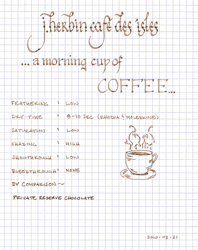
    J. Herbin Café des Îsles is an aptly named brown ink, as, more than anything, it resembles the color of coffee. Other reviewers have mentioned its similarity to café au lait or to espresso, depending on the wetness of the line, and I find the comparison apt. Imagine dipping one's pen in a cup of coffee and then writing – that's the color of this ink – and the varying strengths of one's beverage are well represented by the low saturation and significant shading that it exhibits. It is also worth noting that, on a cream or off-white paper, it takes on a delightful sepia tone.

    As with other J. Herbin inks, Café des Îsles flows easily in each pen I own. It is not as wet as Vert Empire or Bleu Myostosis, behaving more like Poussiere de Lune. The degree of feathering seems dependant on the paper in question: on Moleskine and Rhodia, there was little to no feathering, whereas on my Ecosystem notebook, the feathering was very noticeable. Regardless of paper, though, the show-through was minimal and the bleed-through nonexistent. Every paper I tried held up well to this ink, including the thin paper of a Moleskine cahier.

    The dry time of this ink seems to be fairly consistent between Rhodia and Moleskine – about eight to ten seconds. However, on a very absorbent paper like the Ecosystem, the ink dried in less than three seconds – likely the trade-off for the increased feathering. Also, as I typically write on an incline, the ink pools at the bottom of letters, thus increasing the time it takes ink to dry when compared to writing on a flat surface. Therefore, flat-writers might experience a quicker dry-time.

    I consider Café des Îsles to be an ink with a high degree of character – one I find myself returning to again and again. Even though it isn't an ink with a high level of contrast, I find its tone to be both easy to read and interesting, which makes it well-suited for journaling or other artistic endeavors.

    J. Herbin fountain pen inks come in a 30ml bottle with an integrated pen rest that is suitable for displaying on top of one's desk.

    A note about the scan: While I've been fairly happy with the representation of the ink color in most of my ink reviews, this ink has proved to be extremely tricky to scan properly. The actual color is slightly less saturated with a hint of cinnamon.

    Review materials: For the wide strokes, I used a Lamy 1.1mm steel calligraphy nib on a Lamy Safari. For the fine strokes, I used a Lamy EF steel nib on a Lamy Safari. The paper is Rhodia 80g.
    seize the dave - a little bit about a lot of stuff: ink reviews, origami, poetry, and more
    my ink reviews
    follow me on twitter @carpedavid

  2. The Following 5 Users Say Thank You to carpedavid For This Useful Post:

    Ahriman4891 (July 6th, 2017), DrChumley (January 11th, 2014), heath (January 11th, 2014), inlovewithjournals (January 11th, 2014), Uncle Bud (January 11th, 2014)

  3. #2
    Administrator eriquito's Avatar
    Join Date
    Jan 2010
    Location
    California
    Posts
    398
    Thanks
    41
    Thanked 233 Times in 45 Posts
    Rep Power
    10

    Thumbs up

    CarpeDavid! (very cool name!)

    I'm working my way through your ink reviews now. This is the first I've seen. What a fantastic job! Thank you!

    After my poor experience with a couple of J. Herbin Verts, I vowed to never use their inks again. However, your review has inspired me to give Café des Îsles a try. I'm very happy with my Visconti Sepia. Perhaps Café des Îsles and the idea of dipping my pen in my morning brew will be even more pleasant.

    AND... you're site is excellent! I've been shunning the frumious Bandersnatch for years. Now I can beware the dreaded Walrus-Bee =) I'm going to be laughing all day.

    Thanks again!

    Eric
    Son of Ragnar

  4. #3
    The Nibsmith dannzeman's Avatar
    Join Date
    Jan 2010
    Location
    IOWA -- Go HAWKEYES!!
    Posts
    1,244
    Thanks
    524
    Thanked 1,837 Times in 439 Posts
    Rep Power
    16

    Default Re: J. Herbin Cafe des Isles

    Wow, fantastic review! The scanned image is very neat. I am surprised to hear you say that the Moleskine performs as well as it does. All of my experiences were rather poor.

    Based off eriquito's comment I can't wait to check or your website, but that'll have to wait until I get home. I'm also excited to get to your other reviews. Oh, welcome to Fpgeeks.

    Sent from my htc HERO using Tapatalk

  5. #4
    Member carpedavid's Avatar
    Join Date
    Mar 2010
    Location
    Cleveland, OH
    Posts
    32
    Thanks
    0
    Thanked 57 Times in 20 Posts
    Rep Power
    0

    Default

    Thanks, Eric.

    I've posted all of the ink reviews that I've written so far, and will make sure to post them here going forward as well as my site and the FPN. It's nice to see another community around fountain pens be established.

    As to J. Herbin - I'm not a fan of all of their inks - some are too watery and some are too unsaturated for my taste. Cafe des Isles and Poussiere de Lune are both pretty great, though.

    Thanks for the kind comments about my blog!

    Dave
    seize the dave - a little bit about a lot of stuff: ink reviews, origami, poetry, and more
    my ink reviews
    follow me on twitter @carpedavid

  6. #5
    Member carpedavid's Avatar
    Join Date
    Mar 2010
    Location
    Cleveland, OH
    Posts
    32
    Thanks
    0
    Thanked 57 Times in 20 Posts
    Rep Power
    0

    Default

    Hi dannzeman!

    Thanks for your kind comments as well! I just recently started writing up reviews, and I've got a lot more ink to review, plus pens, paper, and other cool things.

    As to Moleskine - my experience is that their products are inconsistent. Some journals will play very well with fountain pen ink, while others do precisely the opposite. I think their QA has picked up recently, though, as I go through an x-large cahier a month for work, and the product seems to be more consistent lately.

    I hope you enjoy the site once you get a chance to look at it.

    Thanks!
    Dave
    seize the dave - a little bit about a lot of stuff: ink reviews, origami, poetry, and more
    my ink reviews
    follow me on twitter @carpedavid

  7. #6
    Senior Member inlovewithjournals's Avatar
    Join Date
    Jan 2014
    Location
    Calgary, Alberta, Canada
    Posts
    454
    Thanks
    898
    Thanked 272 Times in 147 Posts
    Rep Power
    11

    Default Re: J. Herbin Cafe des Isles

    LOVE this ink! And all of your ink reviews.
    Check out my blog: http://inlovewithjournals.wordpress.com/


    The perfect place for a writer is in the hideous roar of a city, with men making a new road under his window in competition with a barrel organ, and on the mat a man waiting for the rent. - Henry Vollam Morton

  8. #7
    Senior Member
    Join Date
    Aug 2013
    Posts
    521
    Thanks
    166
    Thanked 476 Times in 160 Posts
    Rep Power
    11

    Default Re: J. Herbin Cafe des Isles

    Nice Review! The ink looks a bit less saturated than I prefer but the review is very well done.

Bookmarks

Posting Permissions

  • You may not post new threads
  • You may not post replies
  • You may not post attachments
  • You may not edit your posts
  •