Results 1 to 4 of 4

Thread: How to Find an Italic Print Style

Hybrid View

Previous Post Previous Post   Next Post Next Post
  1. #1
    Junior Member kansaskyle's Avatar
    Join Date
    Feb 2015
    Location
    Austin, TX
    Posts
    29
    Thanks
    4
    Thanked 2 Times in 2 Posts
    Rep Power
    0

    Default How to Find an Italic Print Style

    Questions
    1. What kind of italic print do you use and/or think is most readable?
    2. Do you emulate an example character set, if so, what one(s) do you like?
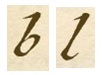
    3. Do you mix and match letters from multiple sets? In all the examples I posted below, there are some little things I don't care for (e.g, the lower-case 'k' with a circle, the upper case 'Q' that looks like a '2', etc.).


    Background
    I'm new to the world of fountain pens, and I'm looking to improve my italic printing. I have a Lamy Safari with a medium nib, and a Pilot 78g with a broad italic nib. I've found I can write much finer lines and flourishes with the italic nib.

    I've done research on character sets to emulate, and I found some are simple and clean looking with little flourish, others have a little more "life" to them, while some are really embellished and fancy looking.

    I'm not too concerned with speed as I generally take soft notes in meetings with my laptop. My writing is limited to correspondence and everyday things (e.g., notes, shopping lists, etc.).


    Definitions and Examples
    I'm defining flourish as things like:

    Loops and Curls
    Accents Lower Case
    Accents On Ascenders


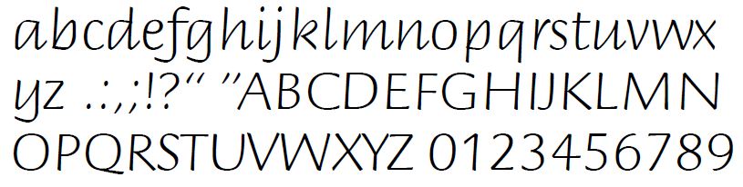
    Simple, low flourish
    This is a character set I found online (I forget the site).

    I think this would be the easiest to emulate because of all the straight lines, and it would be the fastest to write out. My concern is it looks rather plain (i.e, no life to it).

    Spoiler: 
    a


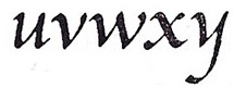
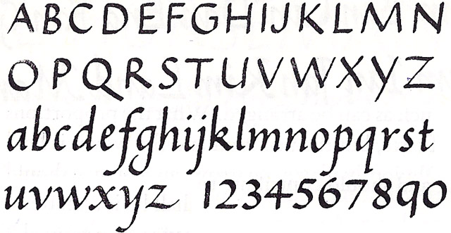
    Clean, with a little more flourish
    This is a character set from Alfred Fairbanks book, A Handwriting Manual.

    The capital letters aren't fancy, but most of the lowercase letters have some flair to them.

    Spoiler: 


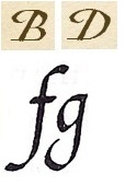
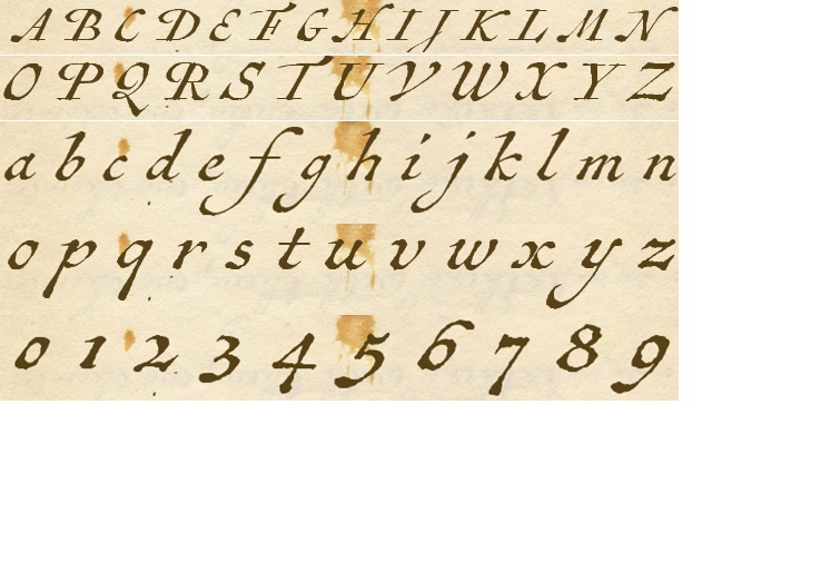
    Vintage map font, high flourish
    This is called Antiquarian Scribe. It is supposedly a vintage map font, and it is for sell as a computer font.

    I have no interest in creating a soft document with it, but I thought it looked pretty neat for handwriting with all the flourish on the capitals and lower case letters. My concern here is I think it looks good in a small sample, but would people really want to read an entire letter written with these types of characters?

    Spoiler: 
    ______________________
    Kyle

  2. #2
    Senior Member
    Join Date
    Feb 2015
    Location
    Boston, MA
    Posts
    215
    Thanks
    366
    Thanked 263 Times in 111 Posts
    Rep Power
    10

    Default Re: How to Find an Italic Print Style

    Kyle,
    Before you start thinking about embellishment styles, the first thing to do the basic exercises to get the italic rhythms into your muscle memory. Those do not vary much between italic styles. You need to be able to form the core forms of lower case letters (the chisel-shapes of the "o" "a" "n" "m", etc.) with smooth and fluid accuracy before anything else. And that comes only from repetition. Put on some nice music you like, grab a few sheets of paper, and just do the drills. As you put in the hours, your hands will start to develop dexterity and you'll find that the more expressive portions of the letterforms will naturally start to build from the foundation you've created. Some will feel more comfortable to make, and by default, look better on the page. But you can't really guess which ones you'll like until you get more practice with the fundamental rhythm of the script itself.

  3. The Following 3 Users Say Thank You to elaineb For This Useful Post:

    brunico (February 3rd, 2015), kansaskyle (February 3rd, 2015), naimitsu (March 3rd, 2015)

  4. #3
    Member brunico's Avatar
    Join Date
    Nov 2013
    Location
    London
    Posts
    59
    Thanks
    57
    Thanked 72 Times in 33 Posts
    Rep Power
    11

    Default Re: How to Find an Italic Print Style

    1. Most readable: relatively simple, pen held at the correct angle and writing not too small for the nib size.
    2. I don't emulate anyone. I've always written in a more or less italic style, and over the years I've made some improvements but also picked up some bad habits.
    3. The Q=2 isn't from an italic fount (as I insist on spelling it).

    The 'life' of italic handwriting comes from rhythm and confidence. These are the things that give it vitality.

    Rhythm is consistent whitespace and rhythmic vertical strokes. This will come with confidence. Confidence is writing intuitively, not scratching about trying to make an exact copy. I often see people trying italic and thinking they have to do all the flourishes, and because they can't execute the letter in one go, it looks awkward, as though flourishes have been bolted on. Or you might even see a lowercase 'l' that's been copied slowly and is bent in the middle!

    Flourishes aren't necessary to italic, but if you use them, they should flow out of the letter (or into it): elaineb is exactly right, so take her advice to heart.

    The Fairbanks example is perfectly fine and elegant. The first example is hideous: I think it's one of those commercial school handwriting programmes.

    Have a look at Bernardino Cataneo for Renaissance perfection and Ludwig Tan for a modern everyday take on italic that has very fluid flourishes.

    The Pilot is a splendid nib.

  5. The Following User Says Thank You to brunico For This Useful Post:

    kansaskyle (February 3rd, 2015)

  6. #4
    Junior Member kansaskyle's Avatar
    Join Date
    Feb 2015
    Location
    Austin, TX
    Posts
    29
    Thanks
    4
    Thanked 2 Times in 2 Posts
    Rep Power
    0

    Default Re: How to Find an Italic Print Style

    Thanks for the replies.

    I saw a post from Kate Gladstone about improving handwriting, and one of the sites she recommended (http://www.studioarts.net/calligraph.../hwlesson.html) includes some practice exercises. I'll get started with those as my warm-up.
    ______________________
    Kyle

Bookmarks

Posting Permissions

  • You may not post new threads
  • You may not post replies
  • You may not post attachments
  • You may not edit your posts
  •