Results 1 to 11 of 11

Thread: Visconti Classic Review

  1. #1
    Senior Member dneal's Avatar
    Join Date
    Mar 2014
    Posts
    5,982
    Thanks
    2,397
    Thanked 2,272 Times in 1,300 Posts
    Rep Power
    16

    Default Visconti Classic Review

    Susanna at Giardino keeps filling up my inbox with stuff I have a hard time resisting. Since I'm posting a review, clearly she got me again...

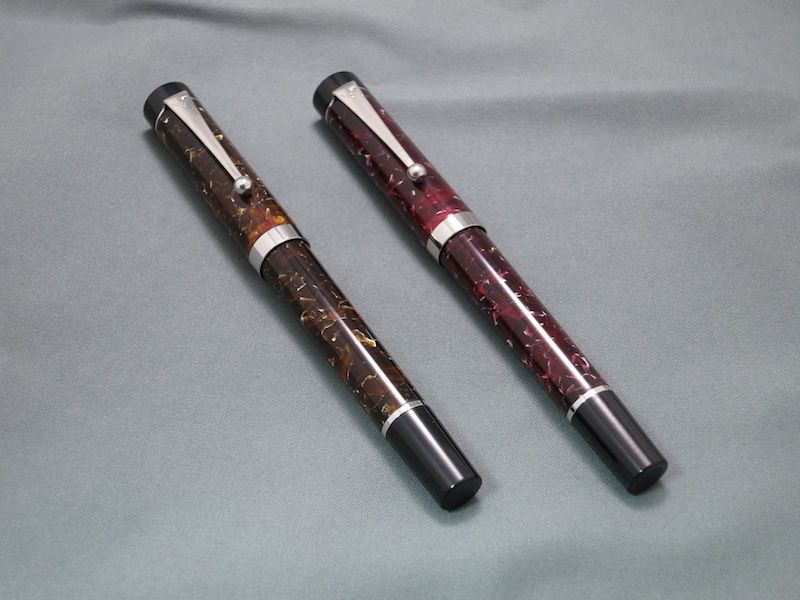
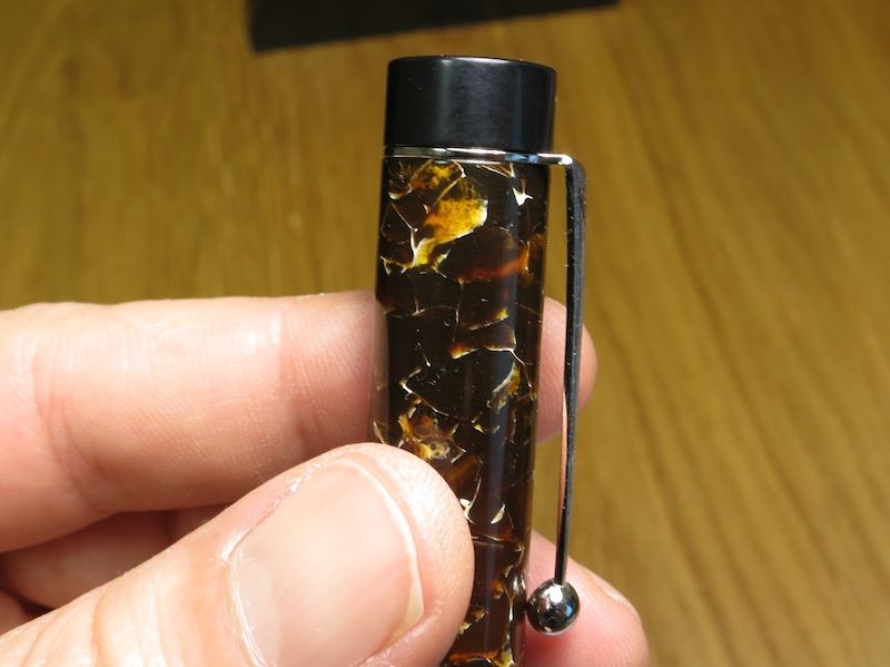
    I was on the fence when I first saw them online, but I did like the cracked acrylic pattern and colors of the brown and red models. Then I saw the price... 80 euros? The exchange rate is essentially 1:1? *sigh* Add to basket and checkout. An impulse gift for me and my wife.

    They arrived today, and I don't think they're bad looking at all.


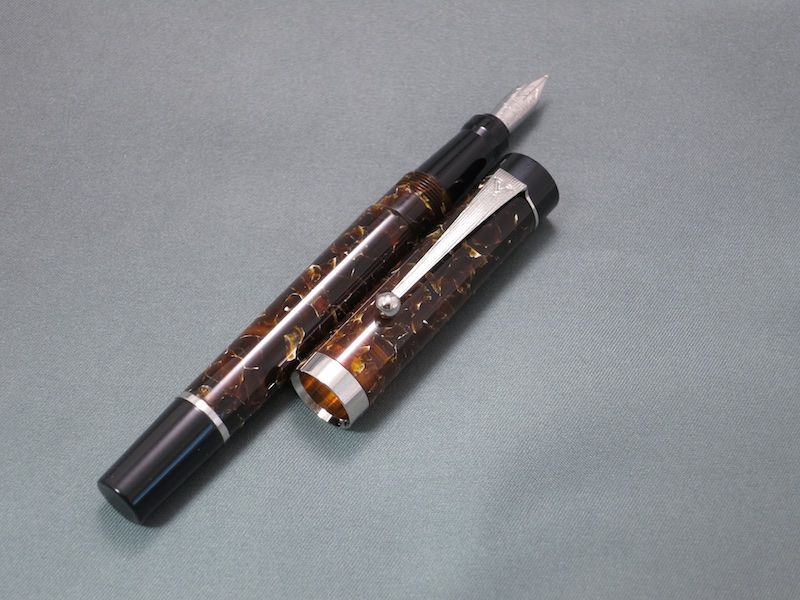
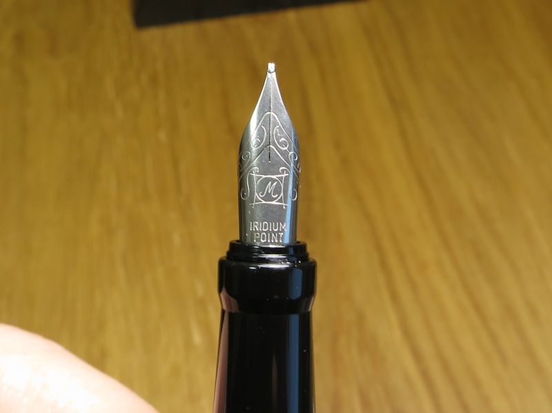
    The nib seems a little small proportionately (exaggerated here by the angle), but I'll just call it "vintage"


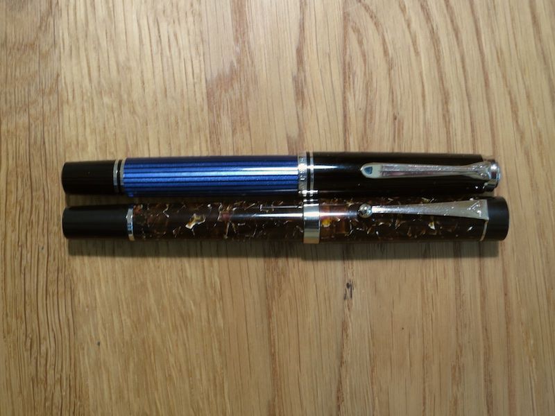
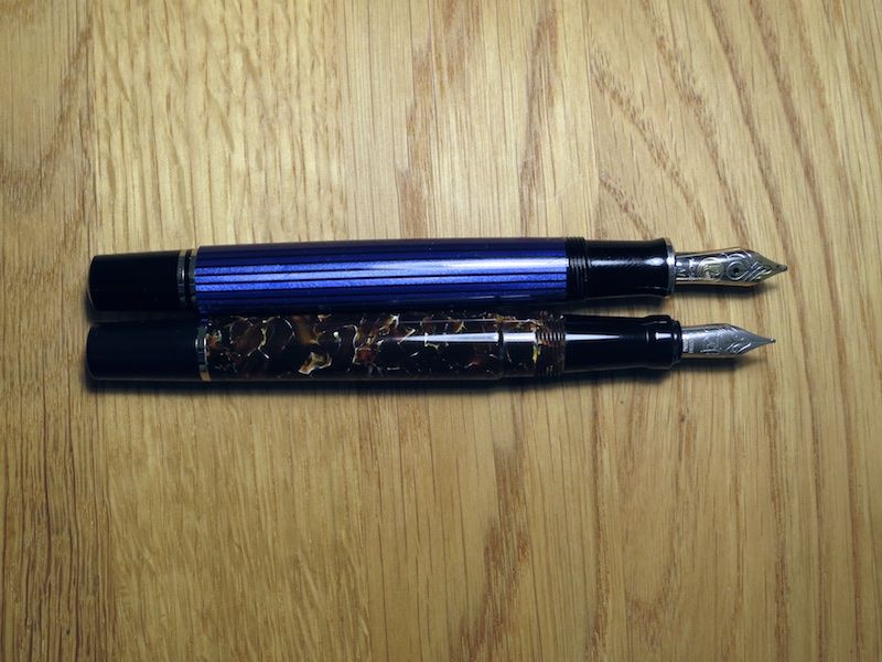
    Size is about the same as a Pelikan M600. It's very comfortable for me, although I would prefer if the section were a bit thicker. The barrel will hold a standard converter (strangely not included), and it will also hold a long international cartridge.


    The biggest question is the build quality, and there is a spirited discussion in the Italian sub forum. I think it's acceptable/good, but not great. In fairness, this pen is only $80 though. It does feel hearty though, and not fragile.

    The clip is quite sturdy, although I don't expect the plating to last (any of the plating, for that matter). If you look closely, you can see that there is some discrepancy in dimensions. This is also the case with the ring and black end of the barrel.


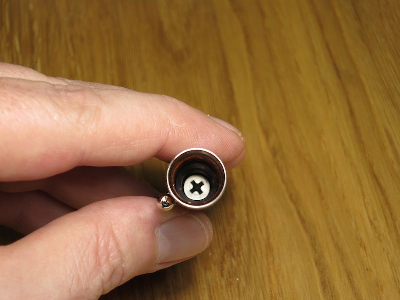
    The Phillips screw holding the cap, inner cap and clip is a little clumsy - but utilitarian.


    Here's a shot of the nib. It's a simple friction fit into the section, and measures 5.34mm in diameter. It should be able to be swapped with a #5 JoWo or Bock. Visually, it's unremarkable (and yes, I've already stubbed it). Tandania mentioned that she didn't understand why they didn't use their standard steel nib. I agree and it baffles me too. I don't see any real cost savings here.


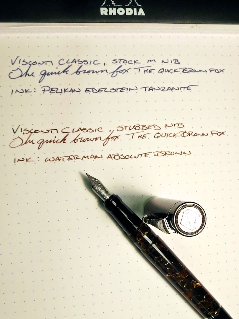
    But at the end of the day, it's a pen. This is where it really comes into its own. That cheap looking little nib is actually a great writer. The tines are uniform and the flow is generous. I did pull and clean them, but made no adjustment (other than the grind on mine). They're very smooth with just a slight hint of feedback. I had a hard time getting the wife's back long enough to take a picture and write a line or two for this review.


    Overall, I like it and it's nice to have a decent looking pen (that writes well) that I can throw in a bag and not worry about like I would an "expensive" pen. I think it was worth the spend. Your mileage may vary.
    Last edited by dneal; March 17th, 2015 at 02:35 PM.

  2. The Following 14 Users Say Thank You to dneal For This Useful Post:

    + Show/Hide list of the thanked

    Bogon07 (March 17th, 2015), carlc (March 18th, 2015), Crazyorange (March 17th, 2015), cwent2 (March 17th, 2015), earthdawn (March 17th, 2015), elaineb (March 17th, 2015), Flounder (March 17th, 2015), fountainpenkid (March 18th, 2015), migo984 (March 17th, 2015), pica pica (March 29th, 2015), Potter (March 18th, 2015), Ste_S (March 18th, 2015), top pen (March 17th, 2015), Yazeh (January 7th, 2023)

  3. #2
    Senior Member Bogon07's Avatar
    Join Date
    Feb 2012
    Location
    Sydney, Terra Australis
    Posts
    2,830
    Thanks
    4,859
    Thanked 1,764 Times in 808 Posts
    Rep Power
    15

    Default Re: Visconti Classic Review

    Thanks for the pictures and review. Good to hear the steel nib is a great writer.
    Maybe Visconti decided to try a different steel nib after the constant whining by some about their regular ones, personally I find them among the best around.
    sinistral hypergraphica - a slurry of ink
    "Nothing means less than zero"

  4. #3
    Senior Member Flounder's Avatar
    Join Date
    May 2013
    Location
    Scotland
    Posts
    374
    Thanks
    285
    Thanked 402 Times in 161 Posts
    Rep Power
    11

    Default Re: Visconti Classic Review

    Thanks for the review, I would not have been aware of this pen without it as I haven't really explored Italian brands yet. That's a really nice acrylic, and the long section looks very comfortable to me! Quite like the clip detail too.
    Latest pen related post @ flounders-mindthots.blogspot.com : '70s Pilot Elite pocket pen review

  5. #4
    Member
    Join Date
    Jul 2014
    Posts
    61
    Thanks
    44
    Thanked 65 Times in 26 Posts
    Rep Power
    10

    Default Re: Visconti Classic Review

    Quote Originally Posted by Bogon07 View Post
    Thanks for the pictures and review. Good to hear the steel nib is a great writer.
    Maybe Visconti decided to try a different steel nib after the constant whining by some about their regular ones, personally I find them among the best around.
    I think that's a little unfair. Some people have legitimate complaints about the Bock units

  6. #5
    Senior Member Bogon07's Avatar
    Join Date
    Feb 2012
    Location
    Sydney, Terra Australis
    Posts
    2,830
    Thanks
    4,859
    Thanked 1,764 Times in 808 Posts
    Rep Power
    15

    Default Re: Visconti Classic Review

    Quote Originally Posted by Ste_S View Post
    Quote Originally Posted by Bogon07 View Post
    Thanks for the pictures and review. Good to hear the steel nib is a great writer.
    Maybe Visconti decided to try a different steel nib after the constant whining by some about their regular ones, personally I find them among the best around.
    I think that's a little unfair. Some people have legitimate complaints about the Bock units
    Like everyone else I can only generalise from my own experience based on 1xF, 2xM, 1xB , 1xEF English flex and 1 x 1.5 italic steel nibs.
    All have been very good writers except the 1.5 italic which is a bit on & off although it is good if I use my right hand.
    Plus Gulliver steel M & F nibs which look the same except for a round rather than a crescent breather hole.

    The brown fleck/cracked acrylic of the new Classic looks very similar to one used in the Gulliver.

    I look forward to trying the nib of a black flecked Classic in the near future and hope it performs as well as the Visconti branded steel nibs I have.
    sinistral hypergraphica - a slurry of ink
    "Nothing means less than zero"

  7. #6
    Senior Member
    Join Date
    Mar 2013
    Location
    Netherlands
    Posts
    163
    Thanks
    28
    Thanked 109 Times in 55 Posts
    Rep Power
    12

    Default Re: Visconti Classic Review

    Thanks for the review, I decided to buy it as soon as I saw it listed on my supplier's site (LCC). But since the nib options are quite limited and it seems a #5 nib, would a TWSBI 530/540 nib fit?
    here men from the pennet earth
    first set nib on the moon
    we came in peace for all penknid

  8. #7
    Senior Member fountainpenkid's Avatar
    Join Date
    Feb 2011
    Location
    Nouvelle Angleterre
    Posts
    3,673
    Thanks
    3,480
    Thanked 1,222 Times in 598 Posts
    Rep Power
    18

    Default Re: Visconti Classic Review

    That nib:the biggest design flop I've seen in a while...
    This is just pure speculation, but maybe they did it to keep it well separated from the more expensive pens in their lineup.
    Will
    If my p.m box is full, feel free to email me at dabantur@gmail.com.

  9. #8
    Member
    Join Date
    Jul 2014
    Posts
    61
    Thanks
    44
    Thanked 65 Times in 26 Posts
    Rep Power
    10

    Default Re: Visconti Classic Review

    Quote Originally Posted by Bogon07 View Post
    Quote Originally Posted by Ste_S View Post
    Quote Originally Posted by Bogon07 View Post
    Thanks for the pictures and review. Good to hear the steel nib is a great writer.
    Maybe Visconti decided to try a different steel nib after the constant whining by some about their regular ones, personally I find them among the best around.
    I think that's a little unfair. Some people have legitimate complaints about the Bock units
    Like everyone else I can only generalise from my own experience based on 1xF, 2xM, 1xB , 1xEF English flex and 1 x 1.5 italic steel nibs.
    All have been very good writers except the 1.5 italic which is a bit on & off although it is good if I use my right hand.
    Plus Gulliver steel M & F nibs which look the same except for a round rather than a crescent breather hole.

    The brown fleck/cracked acrylic of the new Classic looks very similar to one used in the Gulliver.

    I look forward to trying the nib of a black flecked Classic in the near future and hope it performs as well as the Visconti branded steel nibs I have.
    Excellent, glad you've had success with your Bock nibbed pens. I'm 0/4 myself.

  10. #9
    Senior Member dneal's Avatar
    Join Date
    Mar 2014
    Posts
    5,982
    Thanks
    2,397
    Thanked 2,272 Times in 1,300 Posts
    Rep Power
    16

    Default Re: Visconti Classic Review

    Quote Originally Posted by fountainpenkid View Post
    That nib:the biggest design flop I've seen in a while...
    This is just pure speculation, but maybe they did it to keep it well separated from the more expensive pens in their lineup.
    I think it's reasonable speculation though. There's a danger in introducing an "entry level" line.

    I intended to pick up a Visconti-branded #5 nib and swap the one that's in it (purely for aesthetics). It writes well enough that I can live with the generic appearance.

  11. The Following User Says Thank You to dneal For This Useful Post:

    fountainpenkid (March 18th, 2015)

  12. #10
    Senior Member dneal's Avatar
    Join Date
    Mar 2014
    Posts
    5,982
    Thanks
    2,397
    Thanked 2,272 Times in 1,300 Posts
    Rep Power
    16

    Default Re: Visconti Classic Review

    I've still been toying with the idea of swapping the nib for a #5 sized Visconti nib, or maybe a plain "warranted" 14k vintage nib (I think the slim shape of the stock nib lends itself well to the latter option).

    Anyway, I couldn't help thinking that the nib and feed looked familiar, and then I compared it to a loose Faber Castell Ambition nib. Same feed and very similar nibs (the FC is a slight bit wider at the shoulders). I'm more convinced that (aside from the mediocre design and "IPG" marking) that this isn't a cheap Chinese nib, but a quality German nib (probably Bock). It also explains why the performance is so good.

  13. #11
    Senior Member dneal's Avatar
    Join Date
    Mar 2014
    Posts
    5,982
    Thanks
    2,397
    Thanked 2,272 Times in 1,300 Posts
    Rep Power
    16

    Default Re: Visconti Classic Review

    Hard to believe this post is almost 8 years later, but a little cardboard box in a DHL plastic/mylar mailer showed up yesterday.

    Inside was some paper cushion, a little envelope, and these. The protective caps are a brilliant idea.

    ViscontiNibs - 1.jpeg

    ViscontiNibs - 2.jpeg

    Popping the caps off revealed these

    ViscontiNibs - 1 (1).jpeg

    I'm 99% sure these are Schmidt made nibs. Not gold, nor palladium or "Dream Touch"; but just simple steel. About like what's in the pen, but finally with a Visconti logo which seems more congruent than the nib it came with.

    Adjustment was horrible. The EF wrote like a medium, it was so wet. The F would barely write. Both had a lot of feedback (not in a pleasant way).

    I spent the day tweaking and testing them, and decided I like the F the best. It's still really fine, and more in line with a Japanese F.

    Here's a loose comparison. I like the newer style feed (right) better, just for aesthetic reasons. They perform identically.

    ViscontiNibs - 1 (3).jpeg

    I definitely like the look of the nib in the pen. The shoulders are ever so slightly wider.

    Left is my wife's pen with the old nib, right is my pen with the new nib.

    ViscontiNibs - 2 (1).jpeg

    Writing sample. I see this pen continuing its note-jotting duties, although it's really pleasant to write with in a longer sitting. Now I just have to figure out what ink to use in it...

    ViscontiNibs - 1 (2).jpeg
    Last edited by dneal; January 7th, 2023 at 05:51 PM.
    "A truth does not mind being questioned. A lie does not like being challenged."

  14. The Following 3 Users Say Thank You to dneal For This Useful Post:

    Chrissy (January 8th, 2023), Lloyd (January 7th, 2023), Yazeh (January 7th, 2023)

Bookmarks

Posting Permissions

  • You may not post new threads
  • You may not post replies
  • You may not post attachments
  • You may not edit your posts
  •