Results 1 to 5 of 5

Thread: Ink Review: Diamine Sapphire Blue

  1. #1
    FPG Donor ♕ Chrissy's Avatar
    Join Date
    Dec 2013
    Location
    United Kingdom
    Posts
    11,455
    Thanks
    6,925
    Thanked 10,466 Times in 4,006 Posts
    Rep Power
    24

    Default Ink Review: Diamine Sapphire Blue

    Diamine Sapphire Blue is a bright blue ink. It’s a mid range shade that leans slightly purple as many Royal Blue inks tend to do. However Diamine Sapphire Blue is more saturated than many standard Royal Blue inks, although it is less saturated than inks like Cornflower, Tchaikovsky and Majestic Blue.

    I wrote my review on Clairefontaine Triomphe smooth coated paper, that is not very absorbent, and I saw no spread, feathering, show-through or bleed-through.

    It’s a fairly saturated ink but I still saw some nice shading. It flowed very well with all of the pens I tried it in, felt neither wet nor dry, and lubrication was nicely smooth across the paper.

    It seems to look more purple with wetter nibs.


    • Start-Up: No start-up problems noticed. No skipping noticed.
    • Dry time: Quick 11-14 seconds on the 90gsm paper.
    • Nib Dry-out: There was no nib dry-out while I put the uncapped pen down to do the comparison ink tests.
    • Clogging: No clogging seen. No Nib Creep / “Crud” seen, even after several days in the pen.
    • Clean-Up: Clean up off of hands and out of pens was very easy.
    • Waterproof: Diamine Sapphire Blue is not sold as a waterproof ink but exhibits some water resistance.
    • It is currently available in 30ml plastic or 80ml glass bottles or standard International sized cartridges and is reasonably priced.
    • Diamine inks sells it directly to end-users on their web-site, and it’s stocked by many retailers worldwide.

    Diamine Sapphire Blue.jpegDiamine Sapphire Blue 1.jpeg
    Last edited by Chrissy; January 11th, 2019 at 05:19 AM.
    Regards, Chrissy | My Review Blog: inkyfountainpens

  2. The Following 8 Users Say Thank You to Chrissy For This Useful Post:

    Ahriman4891 (January 11th, 2019), aurore (January 10th, 2019), carlos.q (January 10th, 2019), ethernautrix (February 8th, 2019), jodylud (January 11th, 2019), Lady Onogaro (January 9th, 2019), Marsilius (January 9th, 2019), Pterodactylus (February 7th, 2019)

  3. #2
    Senior Member
    Join Date
    Aug 2018
    Posts
    489
    Thanks
    208
    Thanked 157 Times in 65 Posts
    Rep Power
    6

    Default Re: Ink Review: Diamine Sapphire Blue

    A lovely review. Actually I would says it is not less saturated than Tchaikovsky, it looks almost neon to me, however it is lighter and more purple.
    Very much agreed regarding flow and lubrication, unlike some other Diamine inks it is not overly wet (gold medal of wetness goes to Midnight or Asa) but flows perfectly nevertheless.

  4. #3
    FPG Donor ♕ Chrissy's Avatar
    Join Date
    Dec 2013
    Location
    United Kingdom
    Posts
    11,455
    Thanks
    6,925
    Thanked 10,466 Times in 4,006 Posts
    Rep Power
    24

    Default Re: Ink Review: Diamine Sapphire Blue

    Quote Originally Posted by aurore View Post
    A lovely review. Actually I would says it is not less saturated than Tchaikovsky, it looks almost neon to me, however it is lighter and more purple.
    Very much agreed regarding flow and lubrication, unlike some other Diamine inks it is not overly wet (gold medal of wetness goes to Midnight or Asa) but flows perfectly nevertheless.
    Thank you. I keep my Tchaikovsky in a TWSBI inkwell and it always becomes much darker in several of my pens. It's one of my favourite inks.
    I always believed that Tchaikovsky was more saturated. The printed lines on that review form are much darker/heavier than those on this review form, yet Sapphire Blue didn't cover the faint printed lines on this form.
    Last edited by Chrissy; January 10th, 2019 at 02:56 PM.
    Regards, Chrissy | My Review Blog: inkyfountainpens

  5. The Following User Says Thank You to Chrissy For This Useful Post:

    aurore (January 10th, 2019)

  6. #4
    Senior Member
    Join Date
    Aug 2018
    Posts
    489
    Thanks
    208
    Thanked 157 Times in 65 Posts
    Rep Power
    6

    Default Re: Ink Review: Diamine Sapphire Blue

    Thank you, this makes sense Yet I still believe a colour can be rather light but more saturated than a dark colour, but I am mainly applying gemstones grading approach so I can be wrong. In fact either more or less saturated, sapphire is a great ink and so is your review, thank you again!

  7. #5
    Senior Member Pterodactylus's Avatar
    Join Date
    Nov 2012
    Location
    Austria
    Posts
    3,885
    Thanks
    2,412
    Thanked 4,804 Times in 1,697 Posts
    Rep Power
    15

    Default Re: Ink Review: Diamine Sapphire Blue


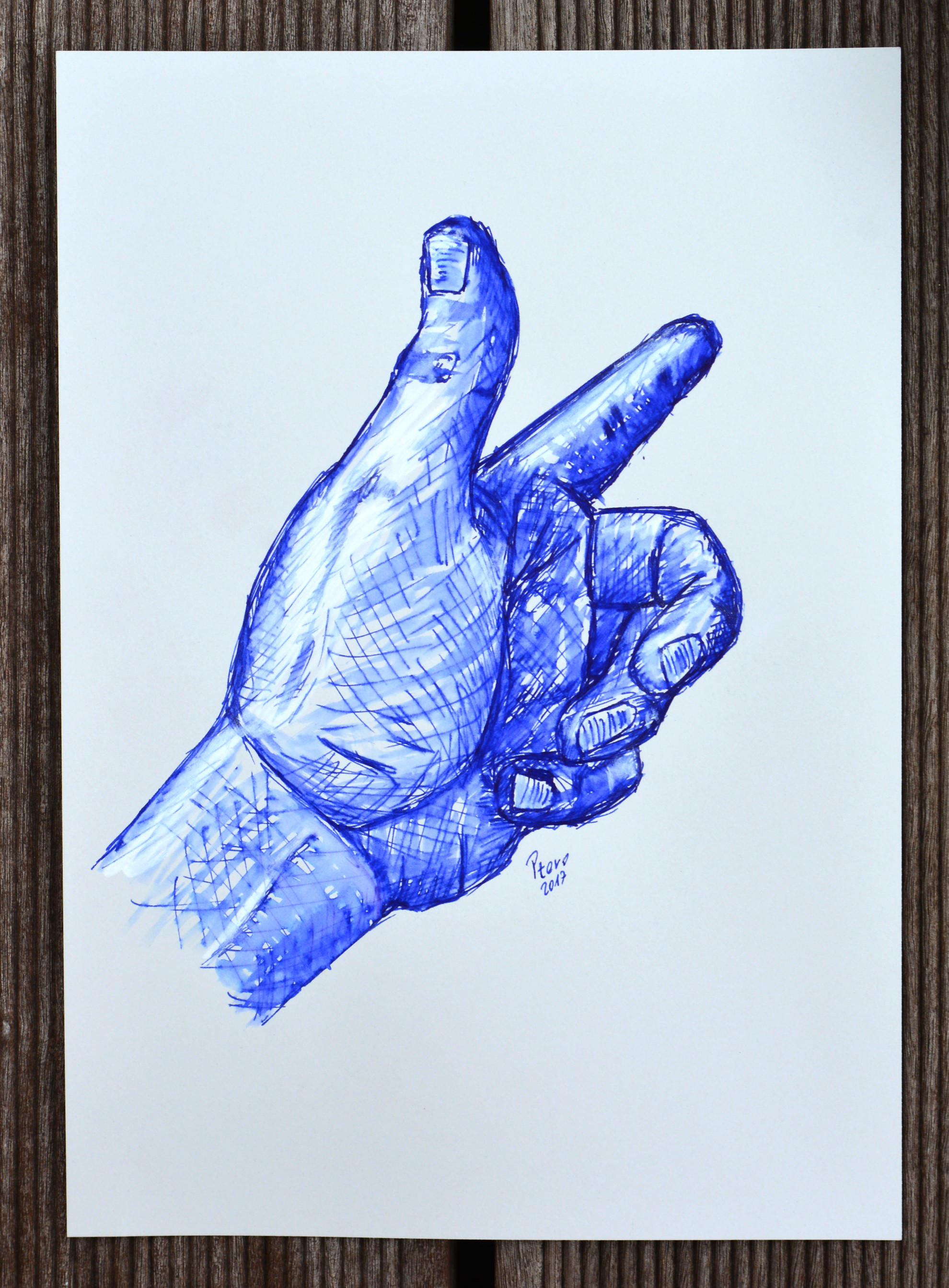
    FP hand sketch 4 by Ptero Pterodactylus on DeviantArt

    (Cross Apogee - M ..... Diamine Sapphire Blue)

Tags for this Thread

Bookmarks

Posting Permissions

  • You may not post new threads
  • You may not post replies
  • You may not post attachments
  • You may not edit your posts
  •