
That is exactly what I was thinking...


That is exactly what I was thinking...
as the title says: ...just some pen pics:

Happy Easter!
Duofold Love.
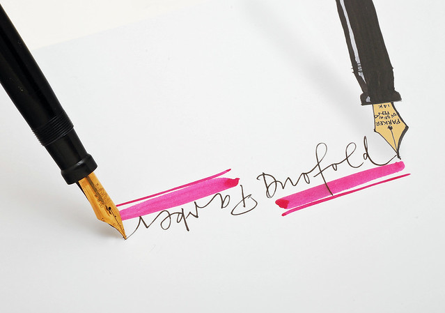
I had this run down Parker 75 in my parts box. The section gold ring was completely corroded away, the clip was bent with lots of brassing and one of the finger clutches in the cap was broken.
Thanks to Parker's modular system, I was able to fully restore it by cannibalizing an ugly old roller ball pen:
Long live the modular system!
Wahl pen, not sure what this material is called.
amk (May 9th, 2022)
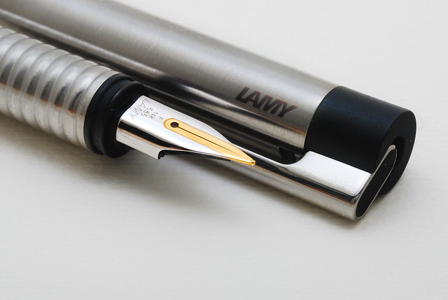
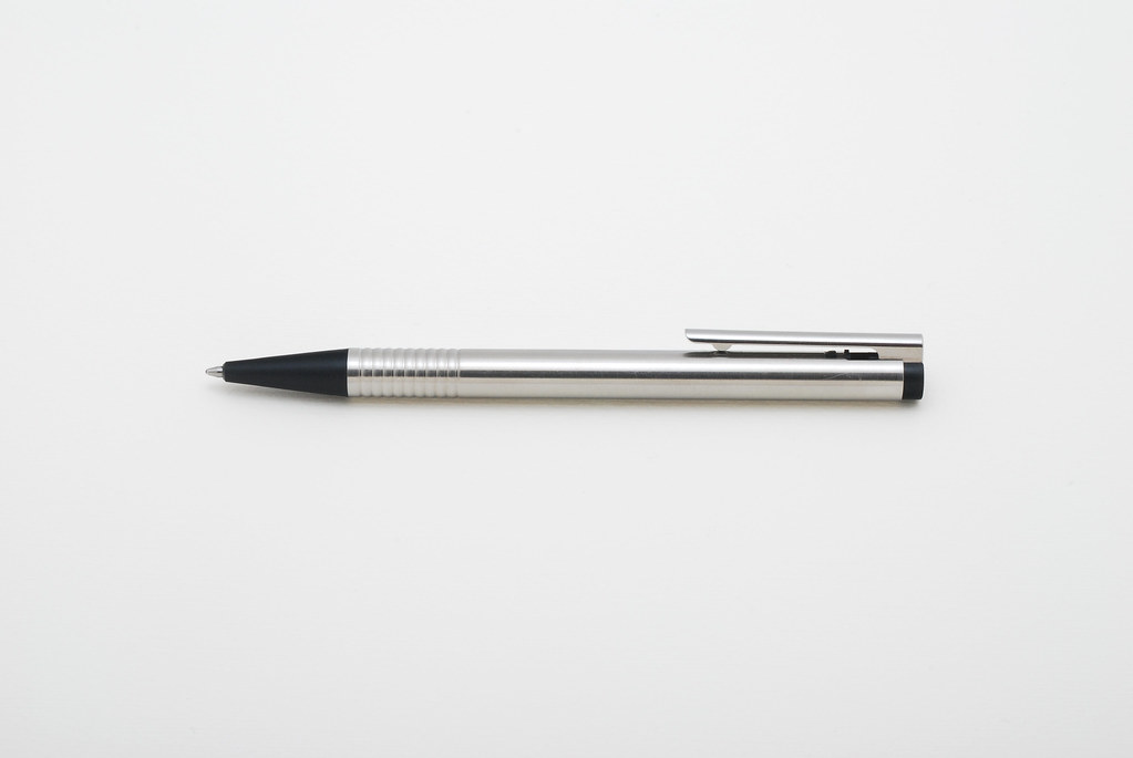
As you may know, I am very fond of the design of the company LAMY. Since the LAMY 27 in the 50's, the company has always amazed with surprising designs.
Although LAMY produced much less fountain pens than the really big manufacturers, there is still always something to discover. One of these discoveries for me is the LAMY Logo.
I am thrilled by this simple and functional design. No detail is superfluous, or left to chance. No wonder, the logo comes from the same designer as its famous brother, the LAMY Safari: Wolfgang Fabian.
For this reason, today I dedicated some photos to the LAMY logo:
I hope that you also like the logo and the photos!
Wonderfully artistic photos christof.It's always a pleasure to just sit and look at them for a while.

Regards, Chrissy
christof (May 2nd, 2022)
Some people have the eye, some people have the skills. Christof has both. And a boatload of great pens, too!
"When Men differ in Opinion, both Sides ought equally to have the Advantage of being heard by the Publick;
and that when Truth and Error have fair Play, the former is always an overmatch for the latter."
~ Benjamin Franklin
I am satisfied that I seem to have succeeded in conveying my enthusiasm for the logo.
I would therefore like to add a few facts about this model.
The LAMY Logo was designed by Wolfgang Fabian.
1985, the Logo ball point pen in brushed stainless steel and other colors was introduced.
1986, the Logo fountain pen in brushed stainless steel was introduced.
1987, the Logo pencil in brushed stainless steel was introduced.
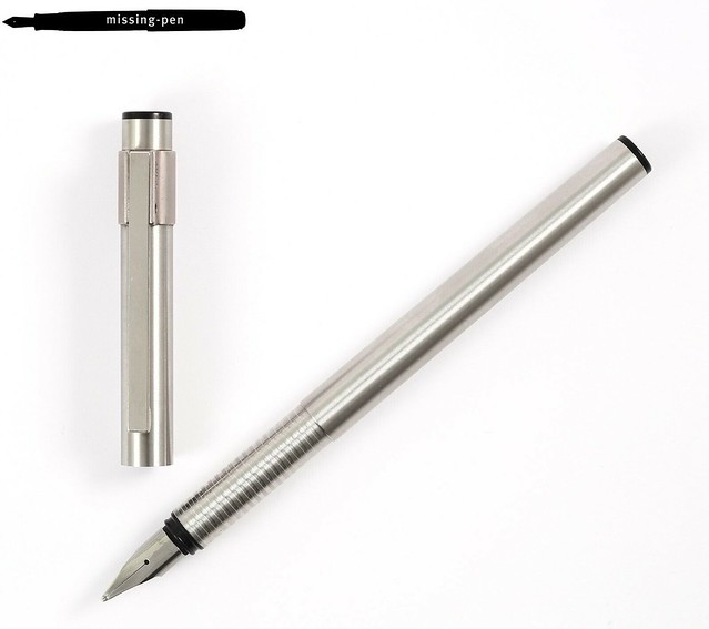
There are several variants of the ball point pen known and were still offered. The FP ins only known in 3 variants:
the basic stainless steel variant, the all black variant (must have been introduced after 1989):
and the current revised version in brushed stainless steel which is still available:
photo: C. Josef LAMY GmbH, Heidelberg Germany
The Lamy logo bears great resemblance to the LAMY unic, which appeared in 1984 and was designed by Gerd A. Müller.
photo by Rolf Thiel
But in fact, the only identical parts that the Logo and the unic have in common are the feeder adn the nib (originally Safari). The LAMY unic gives me the impression that it was more expensive to manufacture, and the logo was possibly the more economic successor. But that is speculation. Nevertheless, like most models from LAMY, the Logo also has an original clip with a suspension mechanism:
drawing from the book: "Füllhalter für Kenner", Hans Heger, LAMY Edition
PS: The logo with gold nib shown in the photos is not original. Logos are and were equipped with steel nibs. This is my personal and upgraded pen:
Last edited by christof; May 3rd, 2022 at 01:26 AM.
Thank you, Christof, for teaching me about the "Logo" pen. Now I understand that Logo is a Lamy brand (with a capital "L"!) that I haven't seen before.
Chrissy (May 9th, 2022), Jon Szanto (May 8th, 2022)
Originally Posted by FredRydr

???
Last edited by christof; May 3rd, 2022 at 11:39 AM.
Chrissy (May 9th, 2022), Jon Szanto (May 8th, 2022)
Just an additional note to Wolfgang Fabian:
I once read an interestic interview with the Designer Wolfgnag Fabian here:
https://scrively.org/inside-statione...n-lamy-safari/
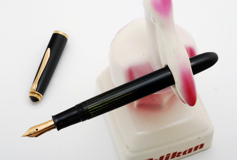
One surprising thing at the end of the interview is that Wolfgang Fabian admits preferring to write with a vintage Pelikan 100, rather than one of the fountain pens he designed!
I find this very sympathetic.
Pelikan 100:
Last edited by christof; May 8th, 2022 at 11:21 PM.
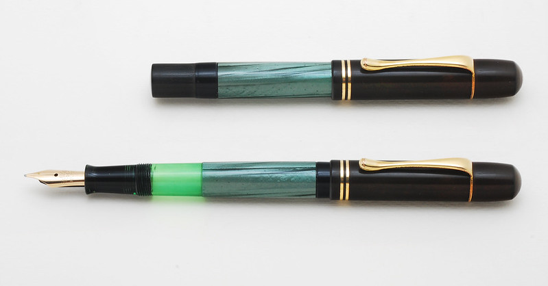
Thought of continuing the Lamy celebration with this neat pen - Lamy 27 demonstrator.
christof (May 10th, 2022), fountainpenkid (May 11th, 2022), FredRydr (May 11th, 2022), Jon Szanto (May 10th, 2022), mizgeorge (May 11th, 2022)
That is a very interesting pen. It makes me think of what the contemporary Platinum 3776 transparent pens would look like if Plat made a piston filler. Markiv, is this a vintage pen or somewhat recent? (I'm assuming the former)
"When Men differ in Opinion, both Sides ought equally to have the Advantage of being heard by the Publick;
and that when Truth and Error have fair Play, the former is always an overmatch for the latter."
~ Benjamin Franklin
markiv (May 11th, 2022)
What a great and rare pen in perfect conditon! Congratulation.
Your LAMY 27 is of the second generation from ca. 1954.
I can ad a picture of a LAMY 99 (3. generation) Demontrator with box:
the box is labeled with "transparent"

Last edited by christof; May 11th, 2022 at 08:23 AM.
Fans of Platinum (and Sailor) have been longing for a piston filler pen, especially in their flagship models. Probably a running joke that it may be planned for their 200th anniversary LE.
Lamy 2K 'demo' - I am looking at you too
amk (May 12th, 2022), Jon Szanto (May 11th, 2022)
That's beautiful Christof. I didn't know it was called Transparent.
Are you bothered by the torn boxes?
I have OCD about it; I use tomoe river strips to glue them from the inside.
I may have posted this photo before, but I'm not certain. Anyway, I realized yesterday that I hadn't turned April -> May pages on my Pen Collectors of America calendar. When I did, I realized it was one of the months they used a photo of mine, one that has been a favorite for a couple of years. Here is my Franklin - Christoph 66P in Antique Glass, sitting on a box made for me to hold blank Thank You cards. My friend decoupaged both inside and out, and I now refer to it as the "Box of Gratitude".
Last edited by Jon Szanto; May 11th, 2022 at 11:34 PM.
"When Men differ in Opinion, both Sides ought equally to have the Advantage of being heard by the Publick;
and that when Truth and Error have fair Play, the former is always an overmatch for the latter."
~ Benjamin Franklin
Yes, I have thought about it too. But the museum people told me to leave it alone (to explain:I donated this fountain pen to the collection of the Museum of Design Zurich, like the majority of my collection).
Here's a link to the online catalogue of the collections:
https://www.emuseum.ch/en/objects/de...bb4ed383&idx=2
There is also a small selection of fountain pens in the permanent design exhibition. Visible in the panoramic view here: https://museum-gestaltung.ch/en/auss...on-highlights/
Last edited by christof; May 12th, 2022 at 12:37 AM.
 Posting Permissions


 Reply With Quote


Bookmarks