


IT CAME! UPS never marked it as out for delivery, but at 3:50pm on Tuesday, the 13th of August a small very light box was delivered to the church office.
I started this project back in January with an image in my mind. Silver goldfish below the surface of a dark pond, moonlit ripples. From there, with the help of folks over on FPN we came up with a guiding name for the pen. Literally Silver Wave (Gin nami) which evoked poetically the image I had of moonlight on the water. From there I emailed with both Nakaya and Classic Pens. Ended up just talking with Classic Pens as direct communication with Nakaya seemed difficult. I explained my vision, that I wanted the Pikolo, the no Ao-Tamenuri finish, silver goldfish roll stopper and gave them the pen's name. Asked the artist to do something special (up to the artist) on the section of the pen that fit the theme and to please write the pen's name in kanji (silver also).
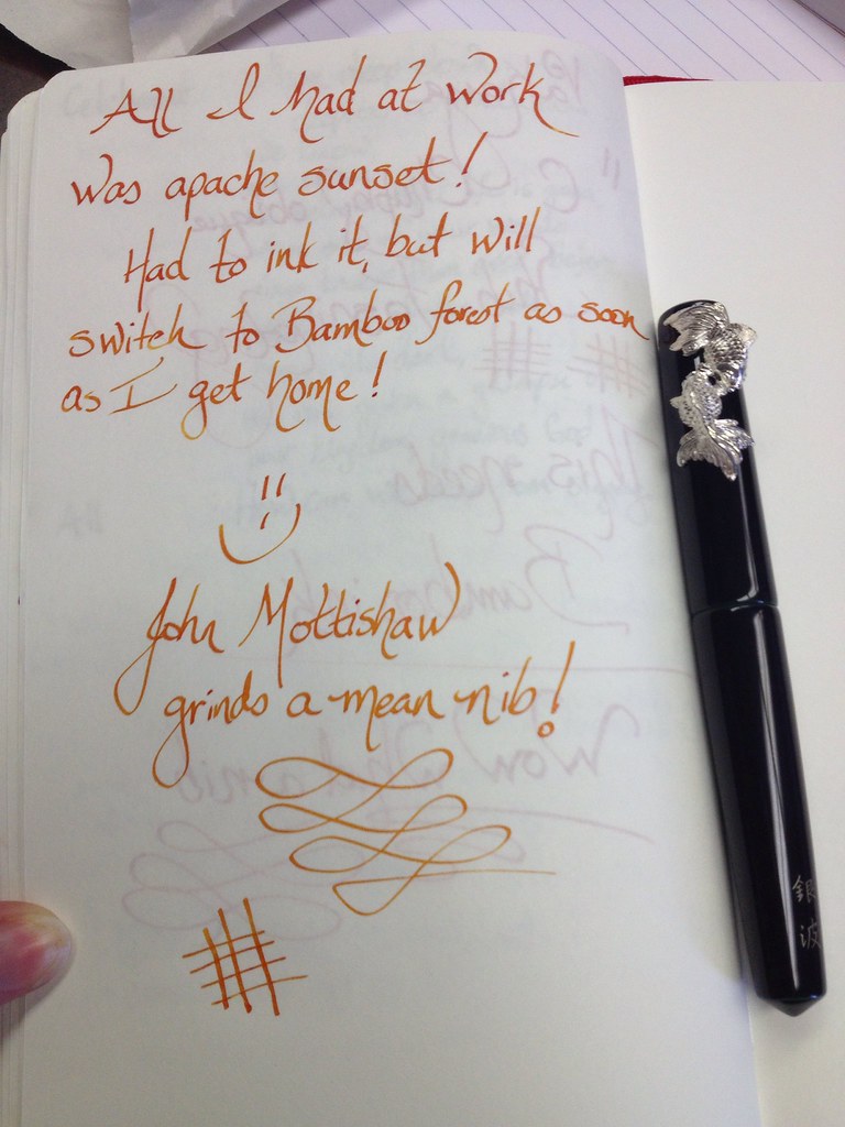
Eight months later John called me to say the pen had arrived. We discussed the vintage nibs I use 90% of the time and he chose to grind a BB nib into an oblique (same angle as antique Pelikan nibs which are my preference) cursive italic for me. It finishes out at 1mm.
Then there was the UPS drama, but by some miracle Gin Nami was delivered just now on the 2nd anniversary of my ordination to the priesthood in the Episcopal church. Here is the documentation of my shaky handed unboxing...
The BOX: (I honestly thought it would be deeper.
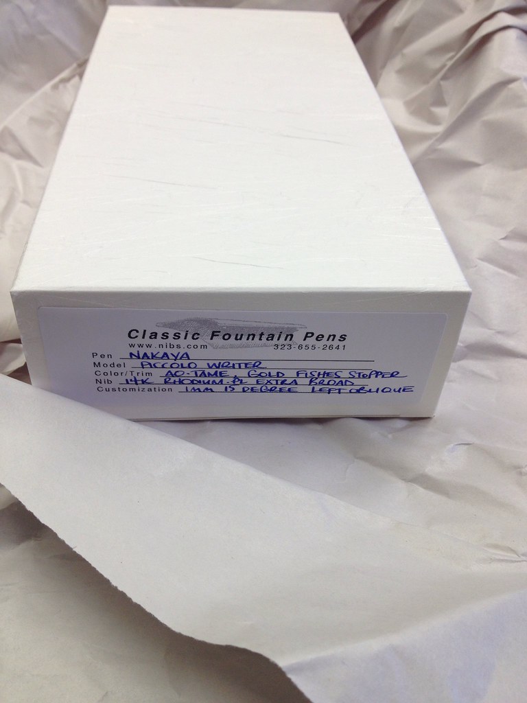
Untitled by JoAndRoses, on Flickr
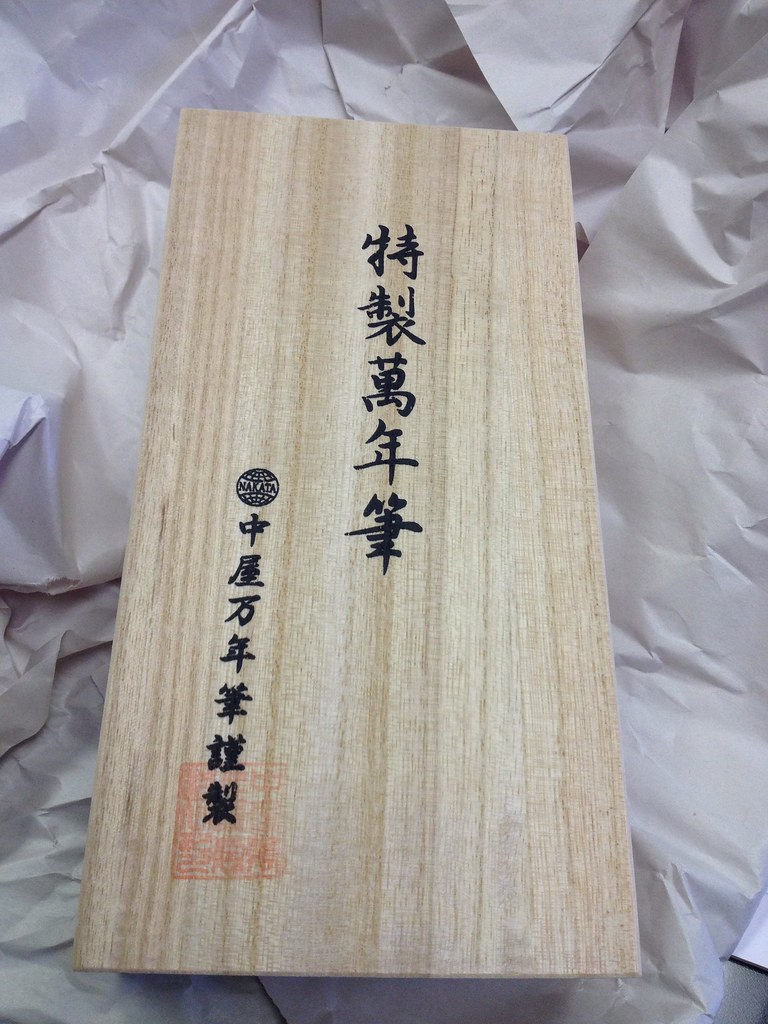
Inside which was another box! This one bamboo I believe and covered with Japanese characters. I really wish I could read them...
Untitled by JoAndRoses, on Flickr
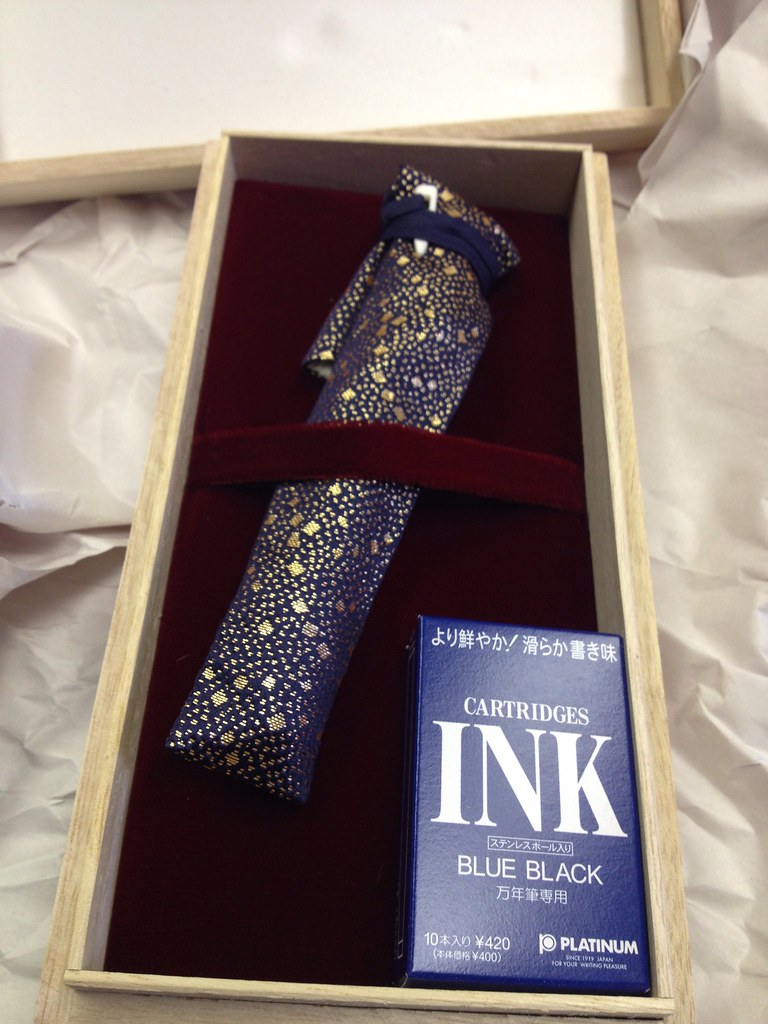
And then there was the inside, the pen tucked in its kimono, the converter is installed already:
Untitled by JoAndRoses, on Flickr
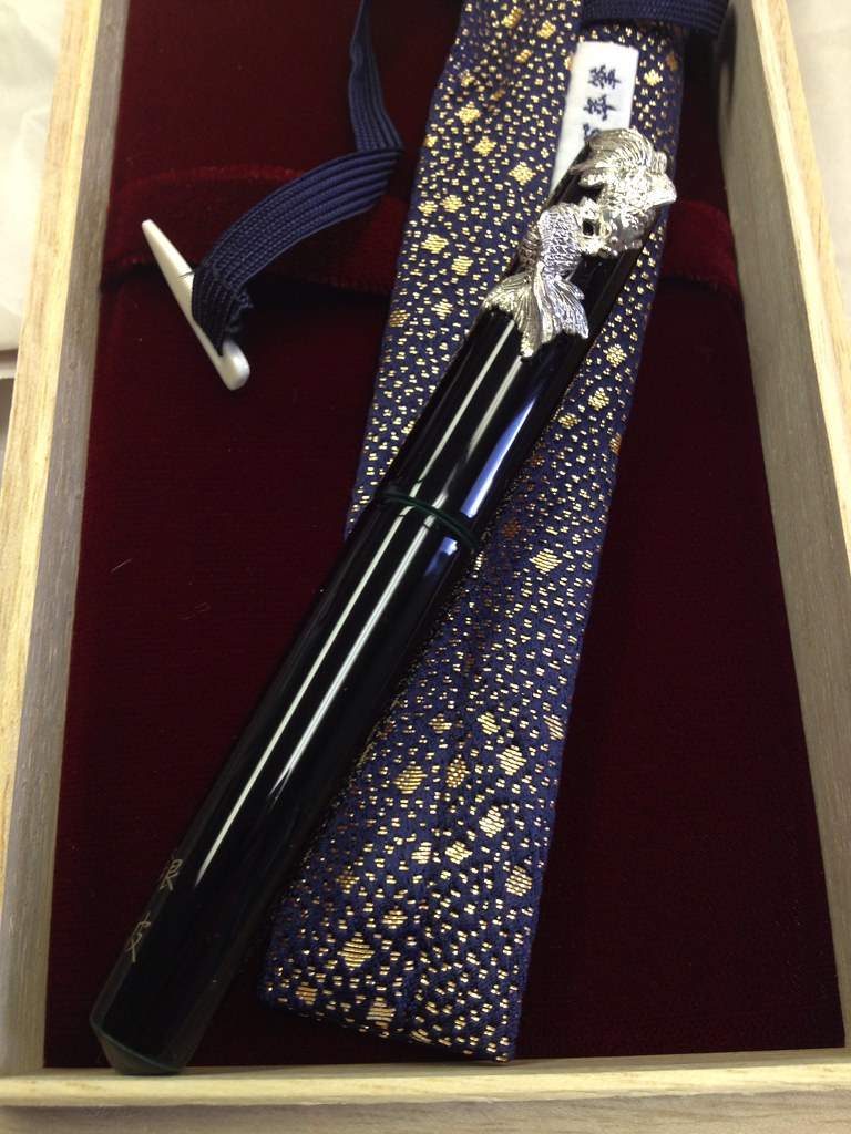
I slid out the pen...
Untitled by JoAndRoses, on Flickr
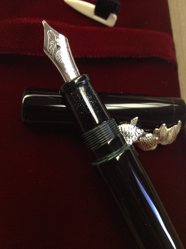
There she is. The ao-tamenuri finish seems to very a great deal pen to pen. I was HOPING for the very bluish-turqouise finish which is fairly light. This is pretty undeniably NOT blue and is VERY dark. Very little color showing capped and what shows leans toward green. I knew this could happen. I'm a little disappointed but I have a feeling in a day or two I wouldn't trade it for the world.
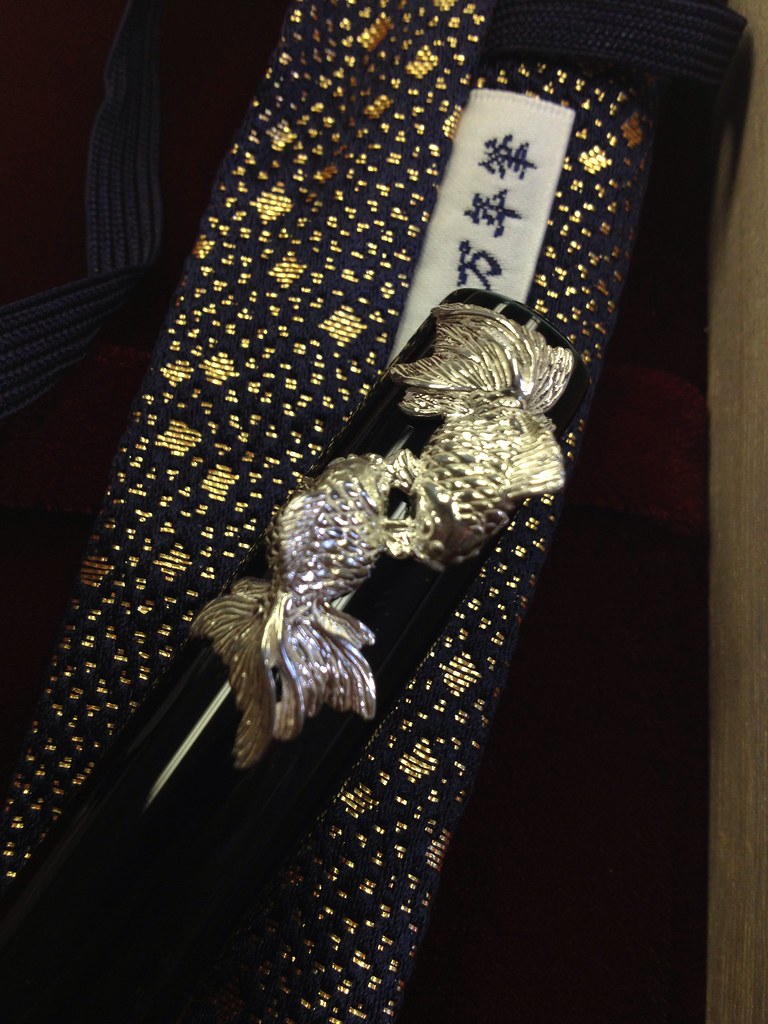
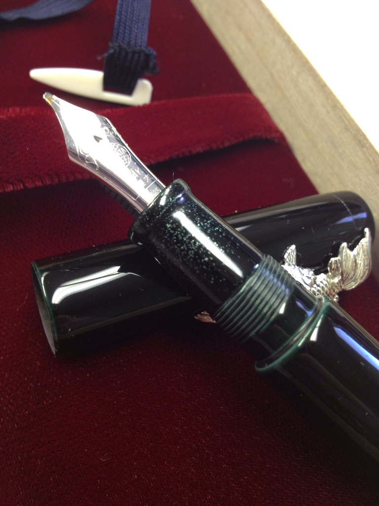
The roll stopper. They really are very cute goldfish. And quite heavy. The pen is not going anywhere capped!
Untitled by JoAndRoses, on Flickr
A closeup of the kanji, again I wish I could read it. I will take for granted that it says something similar to what I meant and let any deviation be artistic/poetic license.
Untitled by JoAndRoses, on Flickr
And the section. This was the treat for me, something I'd likely be the only one to see or appreciate on a daily use basis. The artist used silver powder. What fascinates me is that instead of it all being in one layer as I've seen on other pens this was obviously applies BETWEEN layers of urushi. There is a lot of depth, some of the silver flakes are silver and right at the surface, some look like pebbles or coins sparkling from the bottom of a pond. And THAT is what happens when you tell an artist to interpret a kanji poem.
Untitled by JoAndRoses, on Flickr
It is extremely hard to photograph well. I'm going to have to pull out the light box and macro lens and such when I get home:
Untitled by JoAndRoses, on Flickr
Finally a quick writing sample with the only ink I had available... Apache Sunset. Makes no sense at all but I simply couldn't wait to ink her. I will flush and fill with Bamboo Forest when I get home, that will fit much better I think!
Untitled by JoAndRoses, on Flickr


 Reply With Quote


Bookmarks