-
July 1st, 2022, 02:01 PM
#1
 (vintage) Pelikan 4001 Brillant Blue
Among fountain pen enthusiasts, ink reviews are very popular.
I have never cared much for inks or colors and mostly use black ink. But I was once asked to review an ink that has long been discontinued. The ink is Pelikan 4001 Brillant Blue.
This is kind of a personal ink review because thanks to my mother I have come into the possession of a small stock of pretty old ink bottles. Although she wrote with a Montblanc since the age of 16, she always used Pelikan ink, probably for reasons of better availability. To stand out from the rest of her class in school (as she herself pointed out), she chose Brilliant Blue instead of the common 4001 Royal Blue.
Since I had no experience with the presentation of inks before , I have long thought about how I could best present and convey this color tone. Since I often work professionally with the "Natural Color System "*, it seemed obvious to me to use this for the determination of the color tone of the brilliant blue.
* https://ncscolour.com/de/ncs/
The NCS system arranges color tones within a "color circle" and nuances (ratio of color tone, white and black) within a "color triangle". Together this results in a body of rotation (double cone) called "color space" by NCS.

the picture explains exemplary the coding system
NCS has extensive color guides that allow the color to be taken directly from the object with a little practice. In the case of brilliant blue, this is the color shade NCS S 4050-B, which comes closest to the ink.

The color is a pure blue, lying exactly between green and red on the color wheel and opposite yellow. The brightness is 4 on a scale of 1-10 from white to black and the color component is 6 on a scale of 1-10 from achromatic to chromatic.
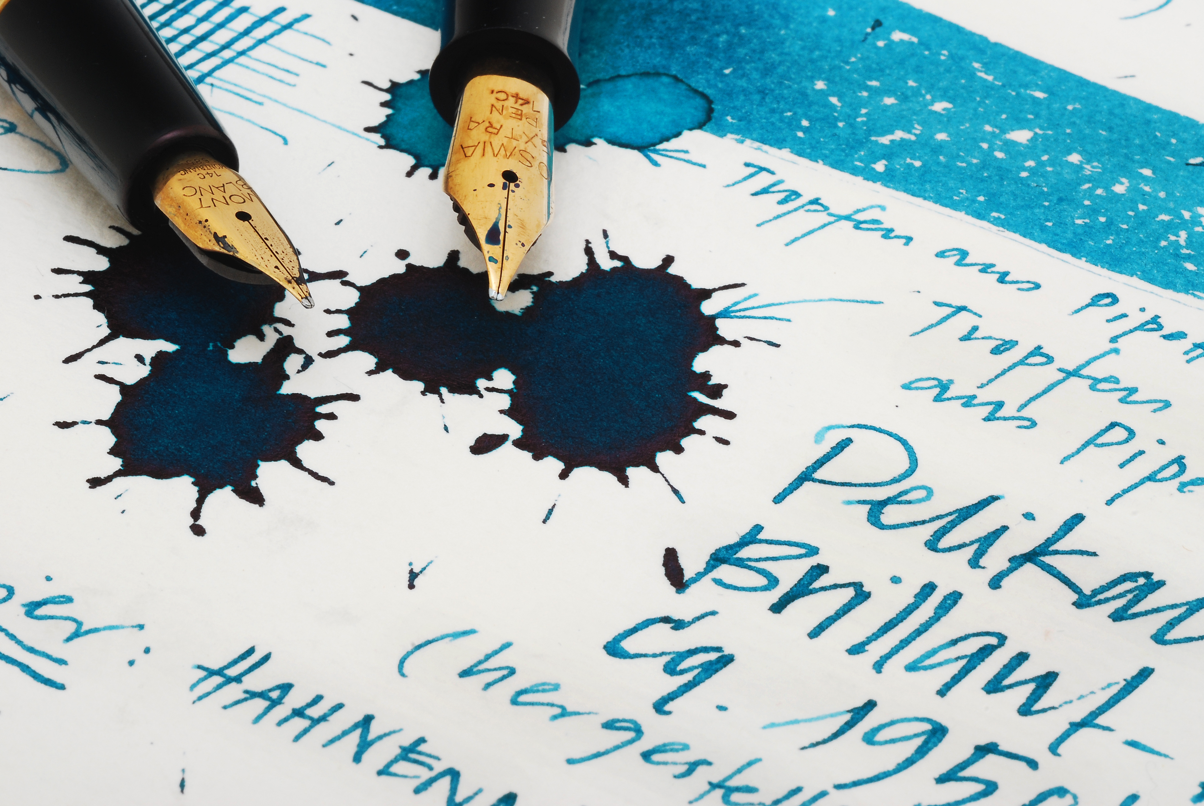
I applied the ink with a brush, dripped it with the eyedropper, and put it to paper with two different fountain pens. I chose a Montblanc 254 with EF nib (my mother's fountain pen) and an Osmia Supra Extra, which has a wet soft stub nib. As a canvas I have used a good watercolor paper.
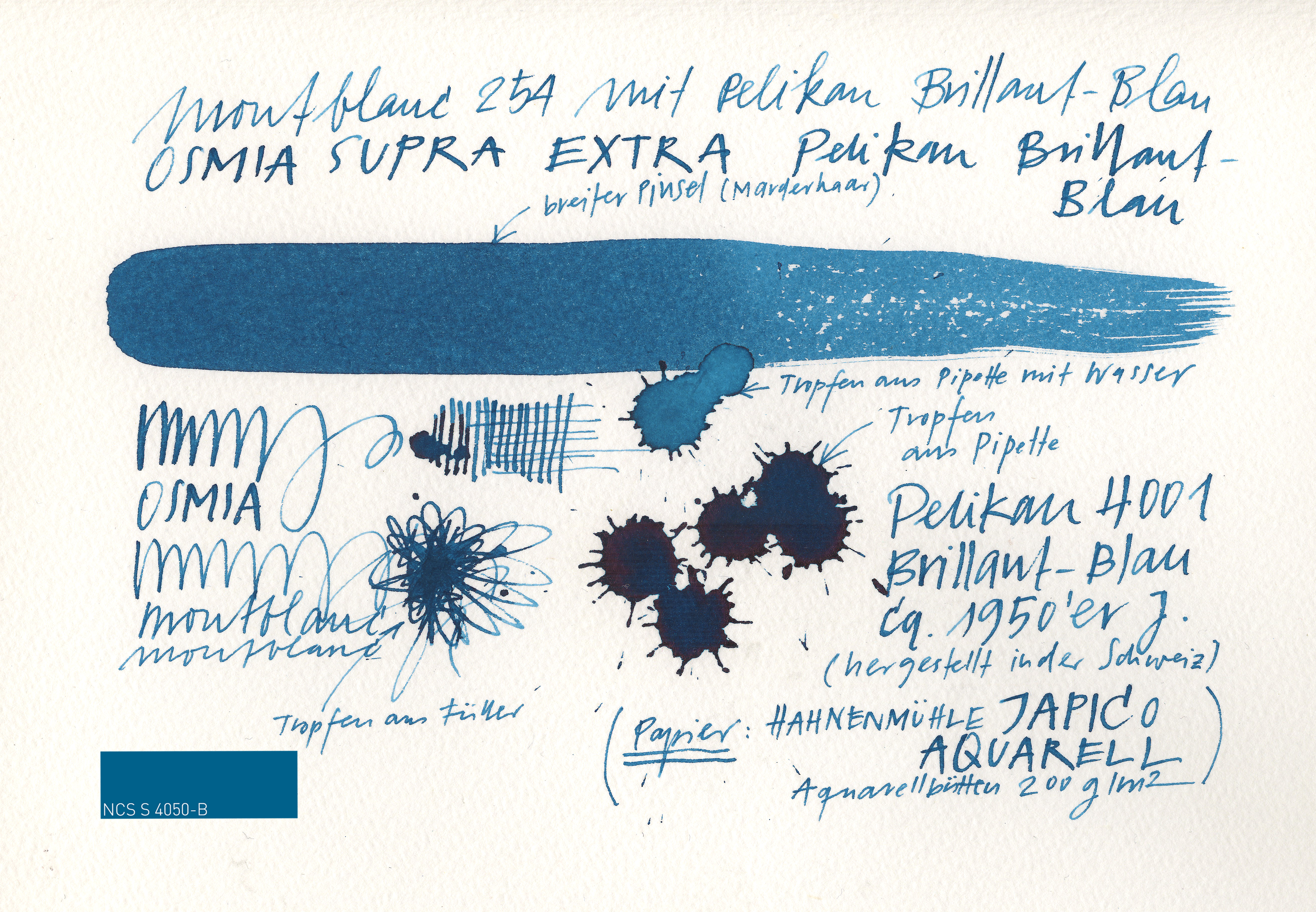


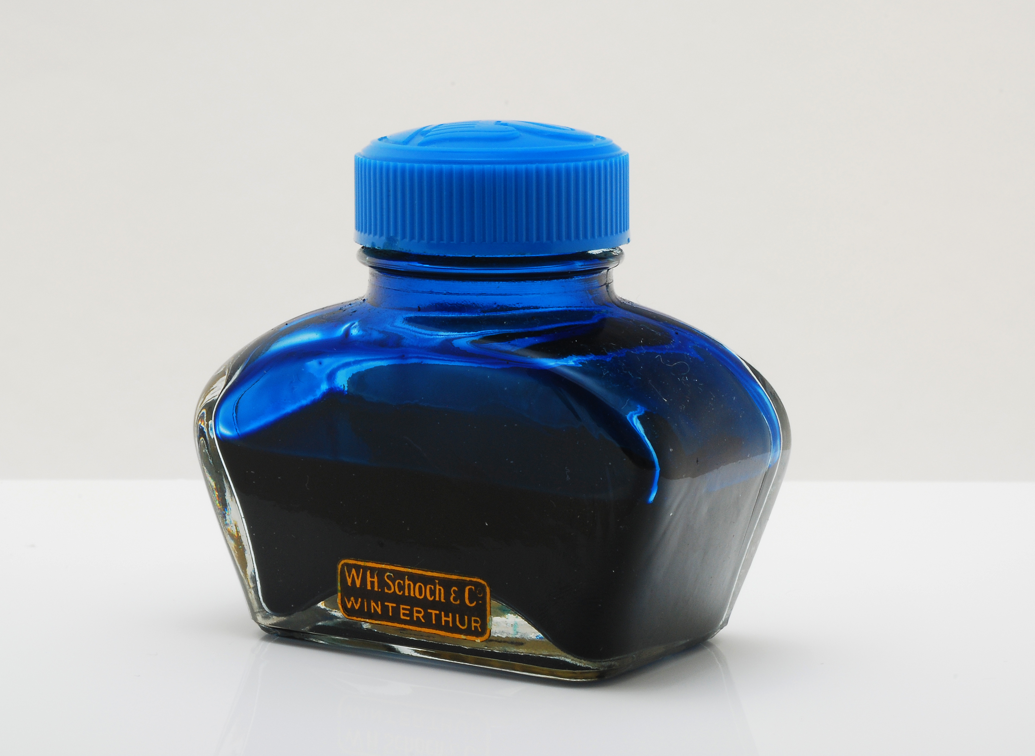
The ink is from a used ink bottle from the 60's. I did not touch the bottle from the 50's because it seemed unused to me. Perhaps it also needs to be mentioned that this is Swiss made ink. However, I assume that the original recipe was strictly adhered to and that the ink does not differ from that of German production.
 [/url]

The stationer's Schoch still exists today and was my mother's main supplier as far as I can remember.
PS: This is the only ink of interest that I own, so please don't expect a sequel.
Last edited by christof; July 3rd, 2022 at 09:29 AM.
-
The Following 12 Users Say Thank You to christof For This Useful Post:
- + Show/Hide list of the thanked
-
bunnspecial (October 31st, 2022), carlos.q (July 1st, 2022), catbert (July 1st, 2022), Chrissy (July 2nd, 2022), Cyril (July 3rd, 2022), joolstacho (September 5th, 2022), junglejim (July 3rd, 2022), mizgeorge (September 5th, 2022), Robert (July 2nd, 2022), Sailor Kenshin (July 2nd, 2022), TSherbs (July 2nd, 2022), Yazeh (July 1st, 2022)
 Posting Permissions
- You may not post new threads
- You may not post replies
- You may not post attachments
- You may not edit your posts
-
Forum Rules


 Reply With Quote
Bookmarks