


For Christmas, I received the Diamine Flower Set from my lovely husband. So yesterday I set about using a dip pen to do a brief comparison of each of the inks. I was honestly fairly surprised. Obviously, since this is a dip pen, the colors are going to be slightly different than in a fountain pen, unless you have a very fine, wet flow! I was most surprised by Carnation and Marigold, which I didn't think I would like. As it turns out, I like them a great deal!
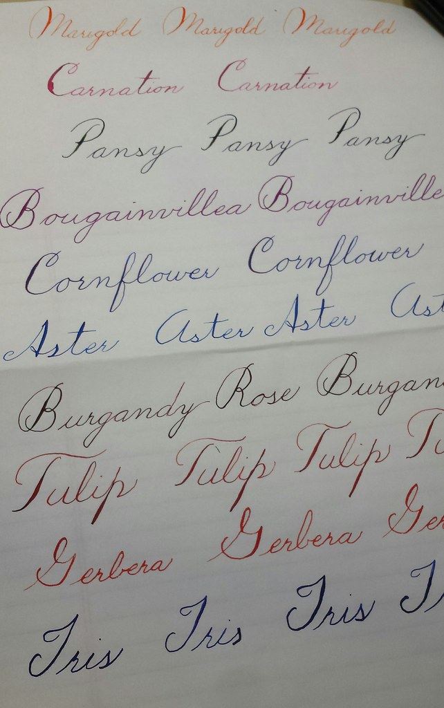
Here is the entire set on white Tomoe River Paper:
Untitled by MarneLM, on Flickr
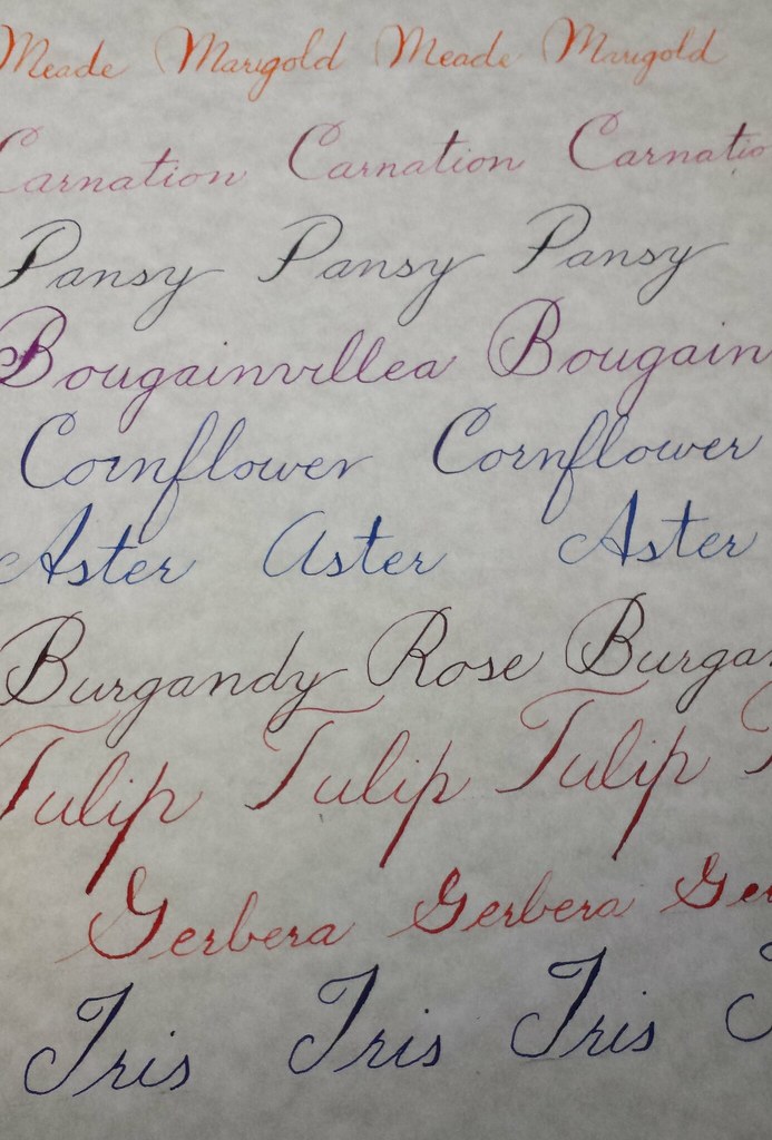
Here is the entire set on Southworth Fine Parchment Paper (sort of a beigey-gray color):
[
Untitled by MarneLM, on Flickr
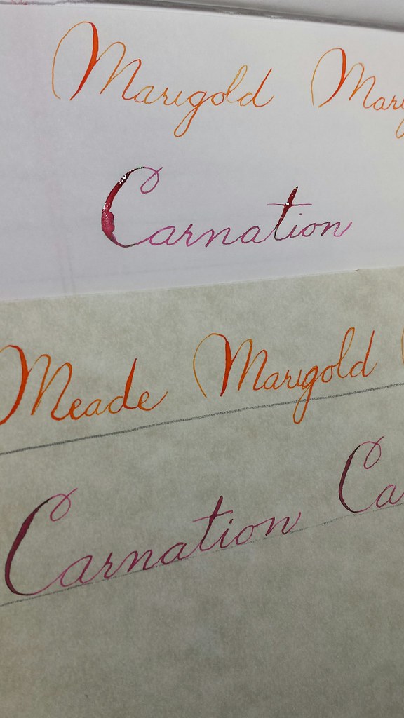
A close-up of Marigold and Carnation:
Untitled by MarneLM, on Flickr
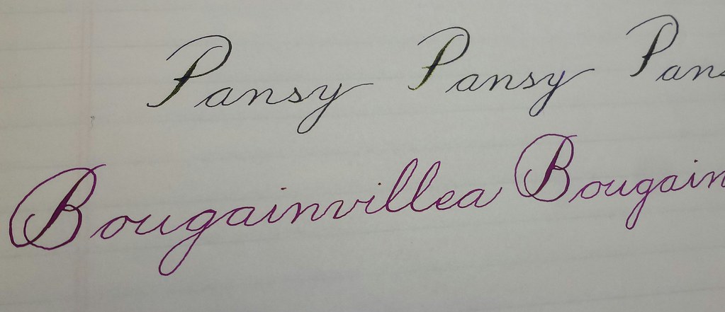
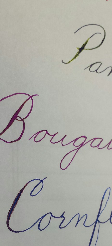
A close-up of Pansy and Bougainvillea (you can see the green sheen of the Pansy):
Untitled by MarneLM, on Flickr
In this one, you can see the reddish sheen on the C in Cornflower, and the greenish sheen on the P in Pansy:
Untitled by MarneLM, on Flickr
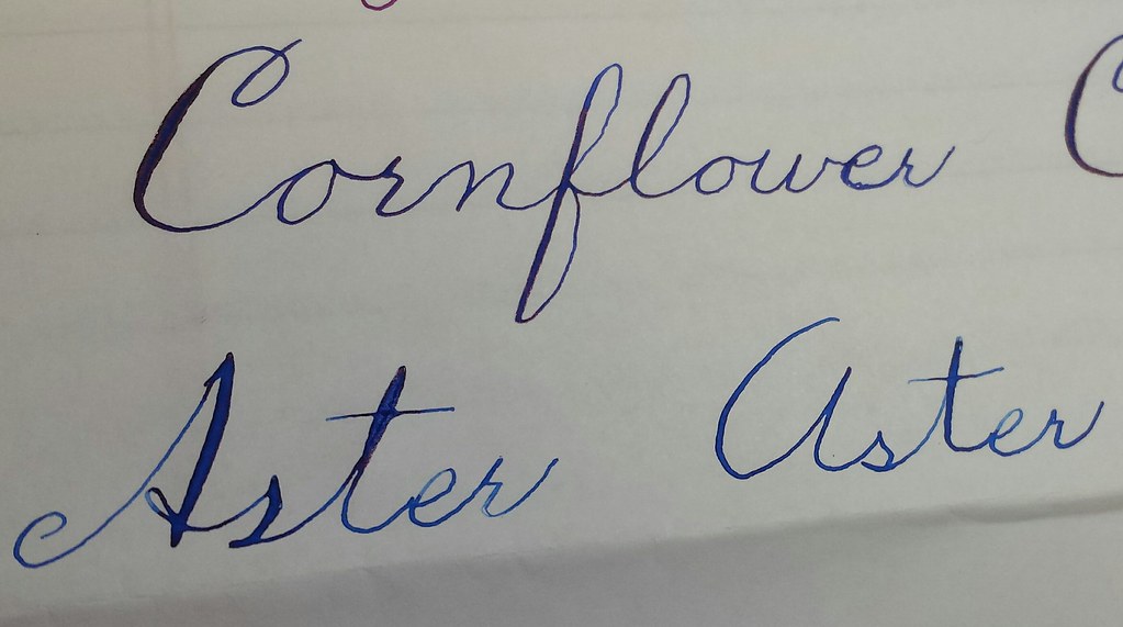
A close-up of Cornflower and Aster (very similar, but Cornflower shades a little more toward purple, imho):
Untitled by MarneLM, on Flickr
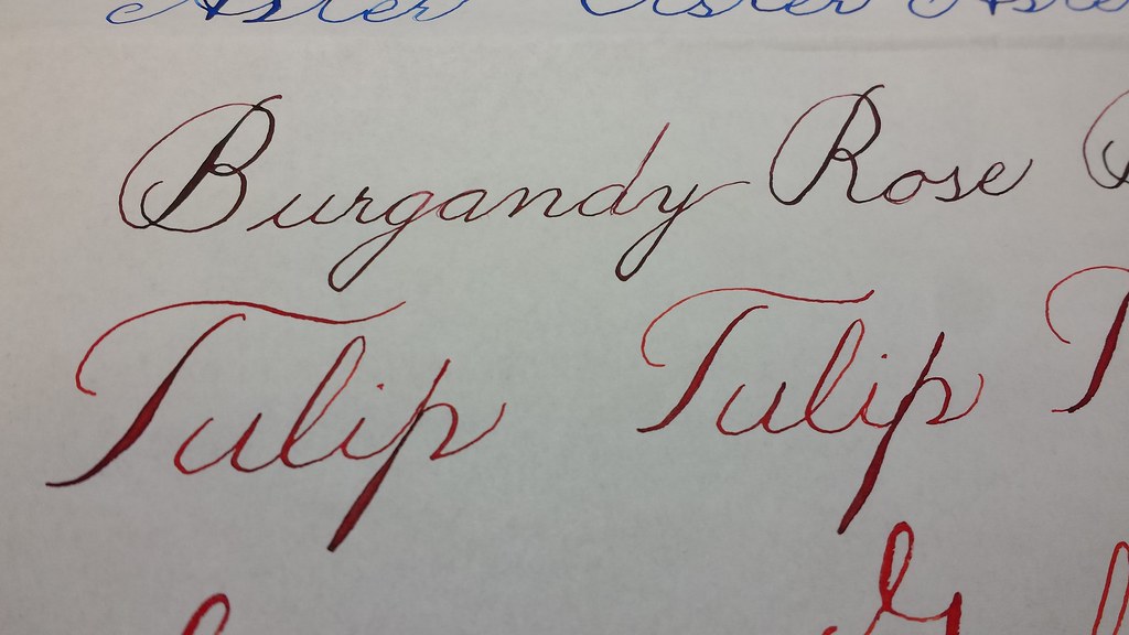
A closeup of Burgundy Rose (a very brown Burgundy -- and yes, I spelled Burgundy wrong :P), and Tulip:
Untitled by MarneLM, on Flickr
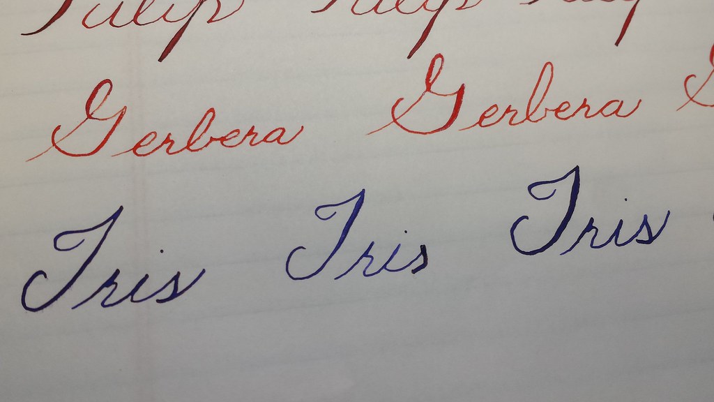
A closeup of Gerbera and Iris:
Untitled by MarneLM, on Flickr
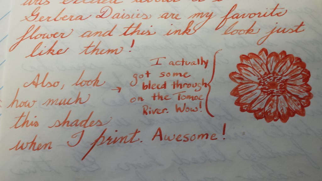
And finally, here is a bit of a letter I wrote using the Tomoe River paper and Diamine Gerbera. It has great shading!
Untitled by MarneLM, on Flickr
Love the whole set!

 Reply With Quote

Bookmarks