Page 1 of 2 12 LastLast
Results 1 to 20 of 34

Thread: Seven New (to me) P.W. Akkerman Inks

Hybrid View

Previous Post Previous Post   Next Post Next Post
  1. #1
    Junior Member halidak's Avatar
    Join Date
    Jul 2012
    Location
    Ankara, Turkey
    Posts
    13
    Thanks
    0
    Thanked 40 Times in 8 Posts
    Rep Power
    0

    Default Seven New (to me) P.W. Akkerman Inks

    (I'm terribly sorry about the images if they are just too big for you. I couldn't manage to make the BB coding for downsizing images work, as I generally can do in HTML codes. They also appear somehow in different sizes while they actually all have the same width. Go figure???)

    A few months ago I first saw the famous P.W. Akkerman inks from The Hague in a very long thread on FPN and, like many of inkaholics among us, I’ve instantly fallen for that beautiful vintage style bottles of these inks. No matter how much I liked the design of these ink bottles I wouldn’t order those all the way from Netherland just for the sake of having a fancy bottle. After all, it’s what is inside the bottle that matters most.

    A little research revealed floating rumours about these inks being made by Diamine. Although I did not have much experience with Diamine all I’d heard about them were high praises about the quality of their inks. I thought it would be woth to try these P.W. Akkerman inks if they were indeed made by Diamine and the bottles were going to be the icing on the cake.

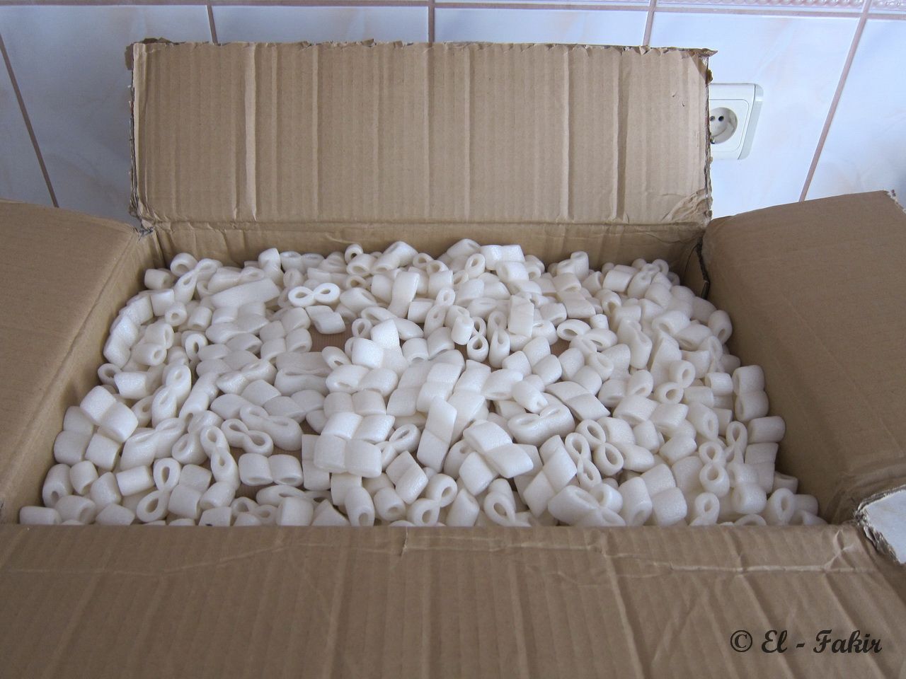
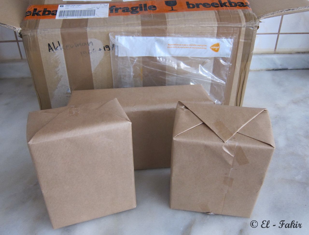
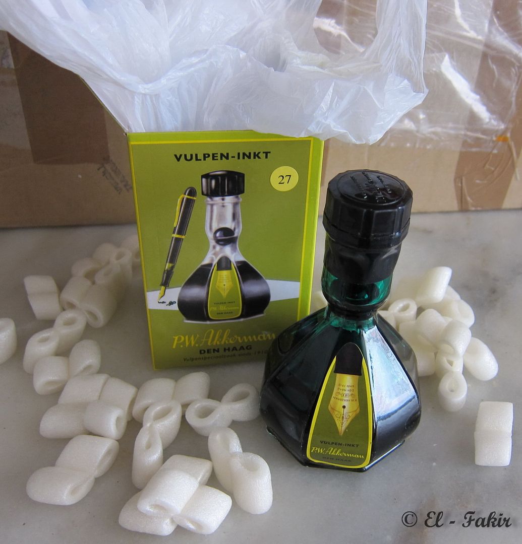
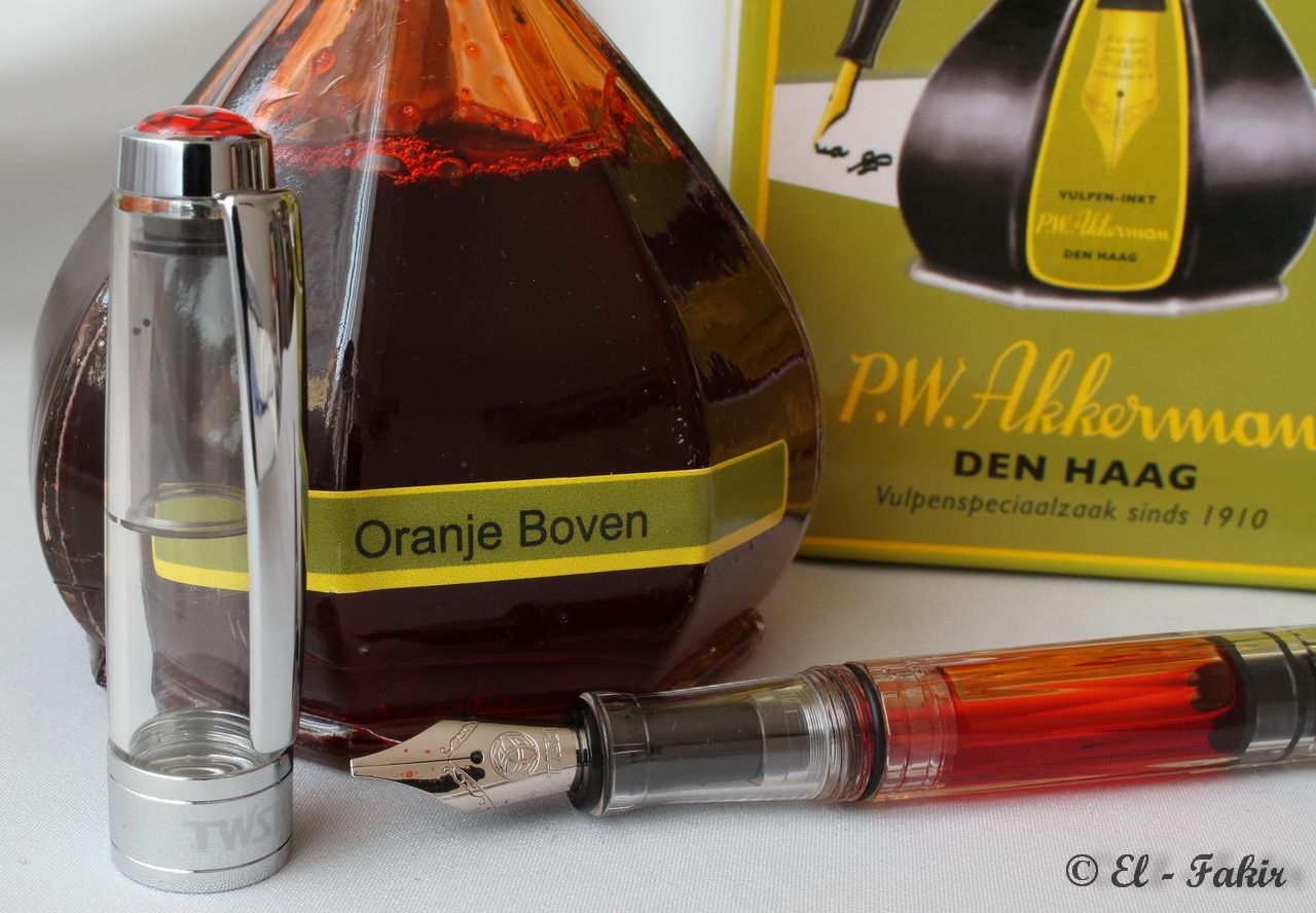
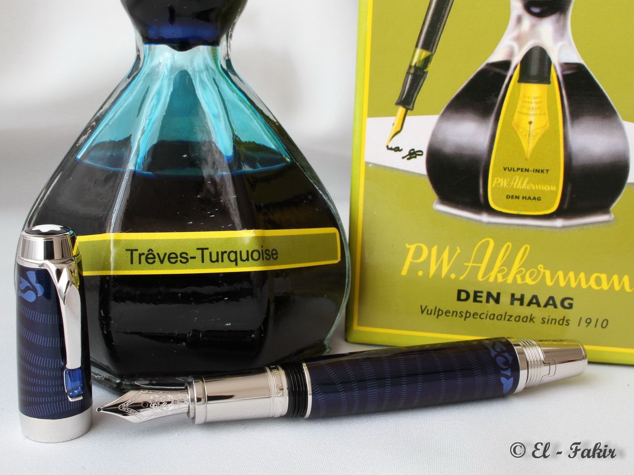
    So I ordered seven bottles with gracious help of Heer. Paul Rutte, store manager of P.W. Akkerman shop. When my order arrived I was amazed by how well it was packed. This package could be air-dropped onto my house and even then the bottles wouldn’t be damaged.


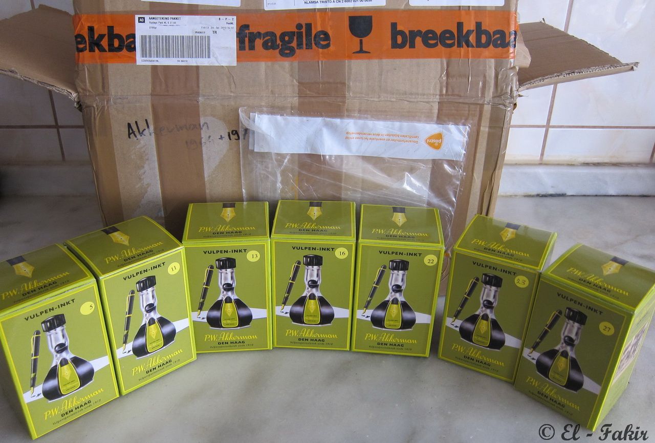
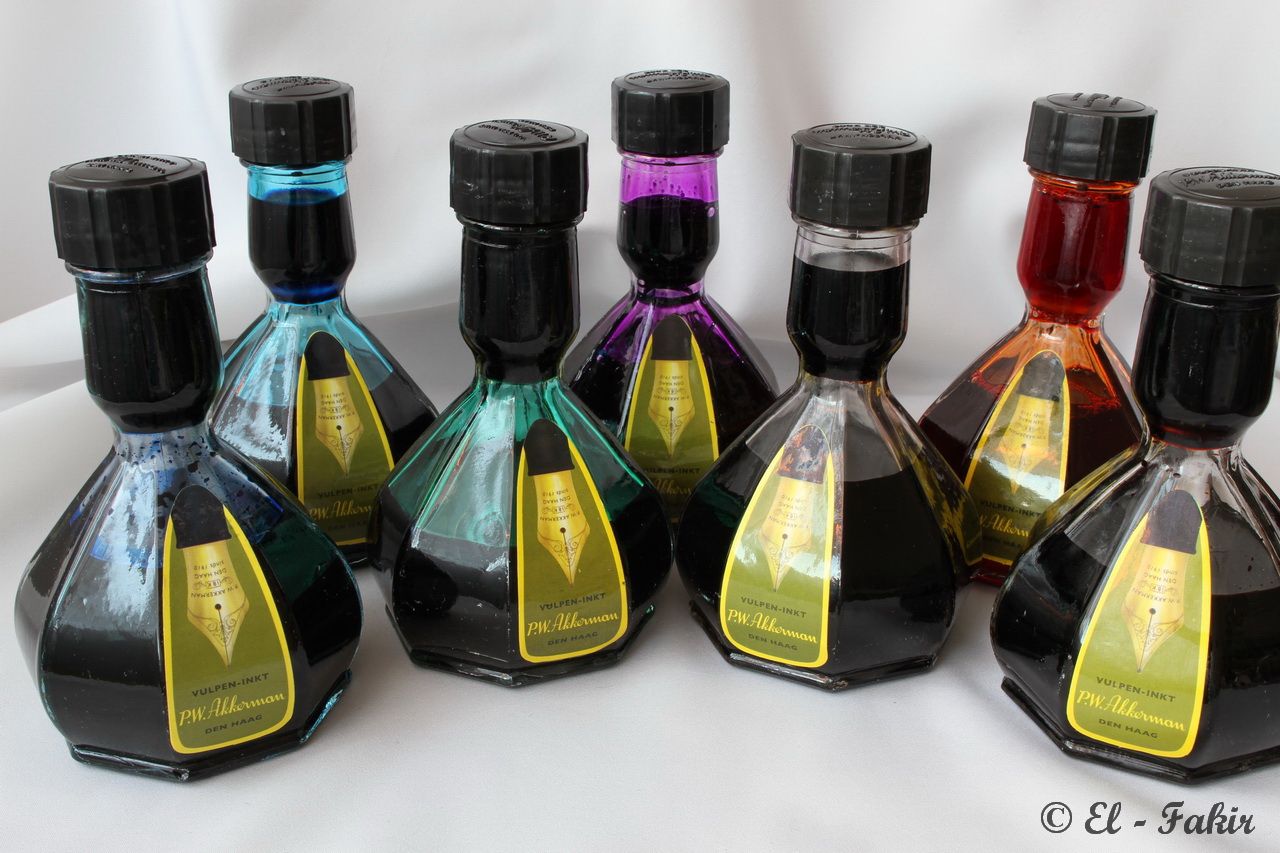
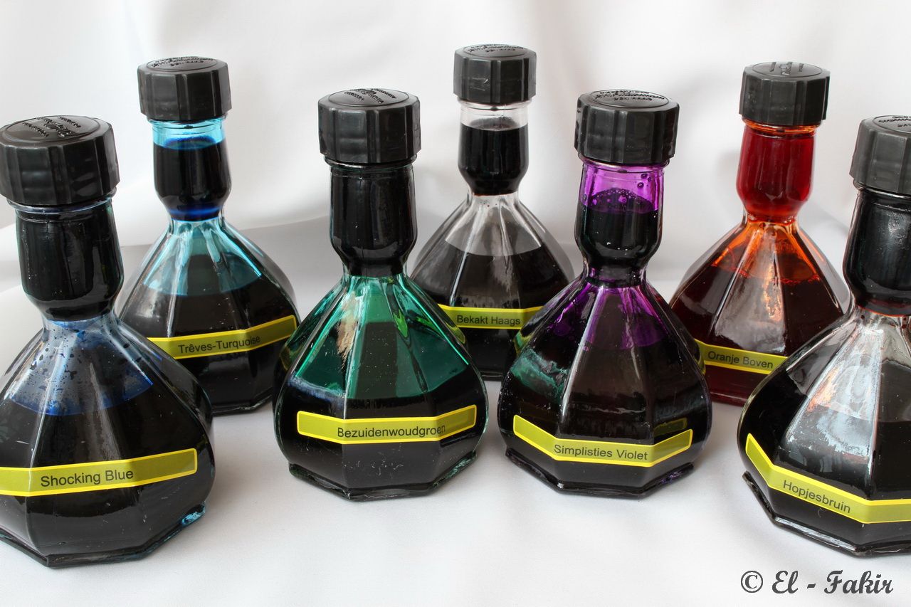
    These are the inks I bought;


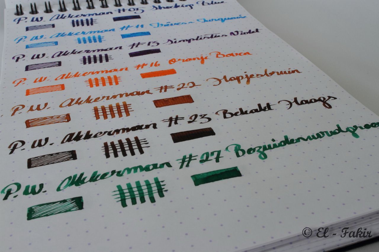
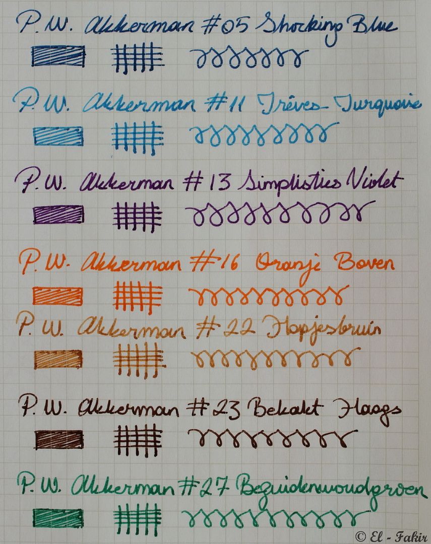
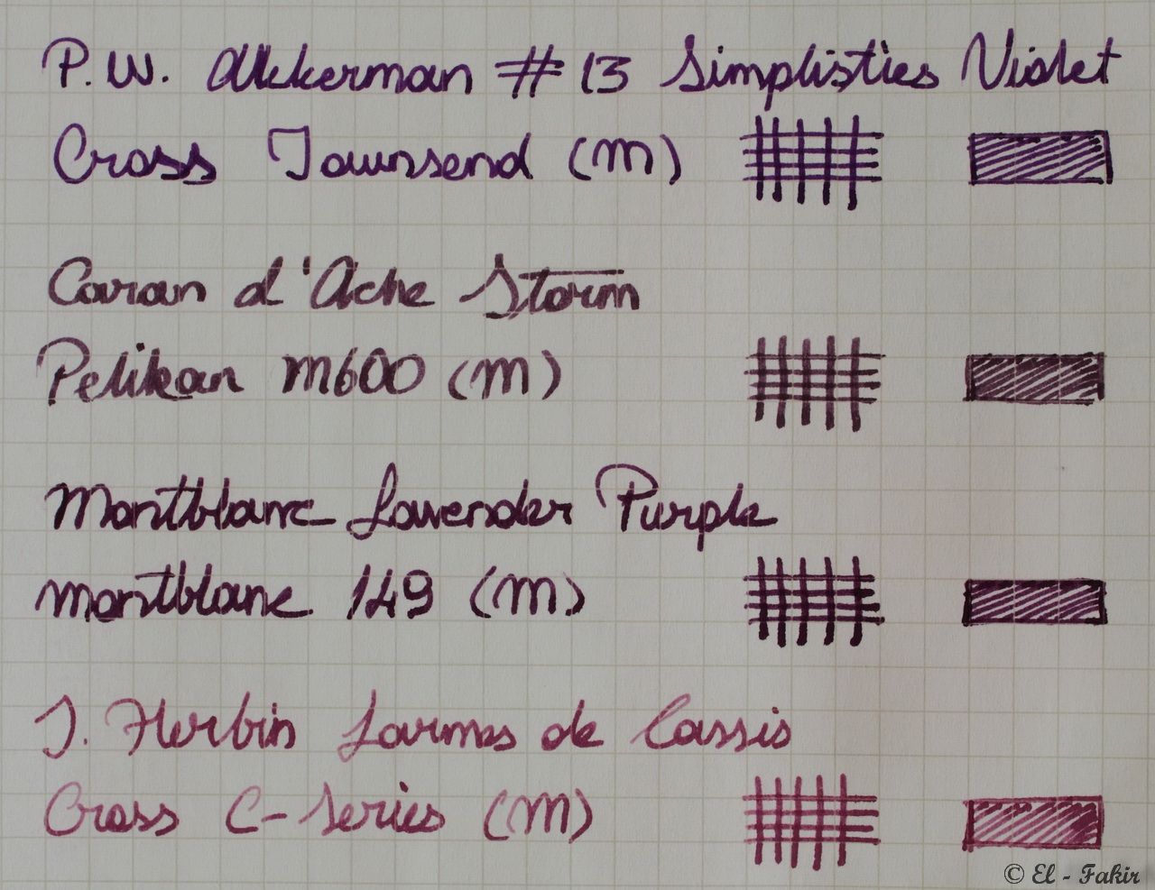
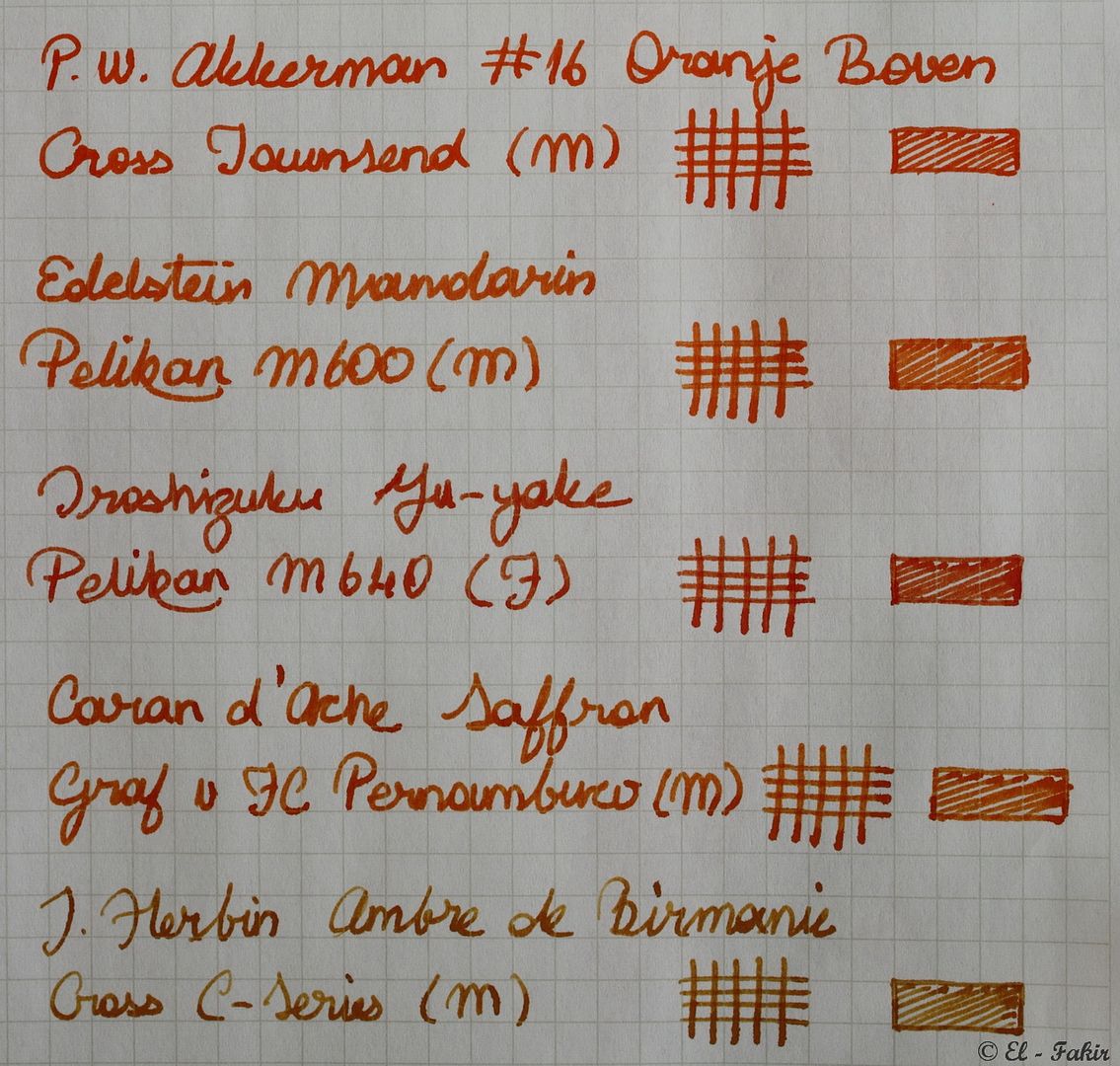
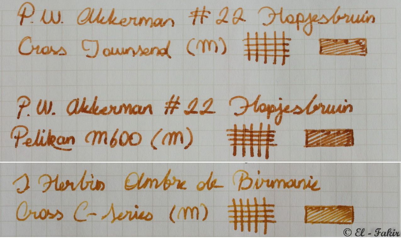
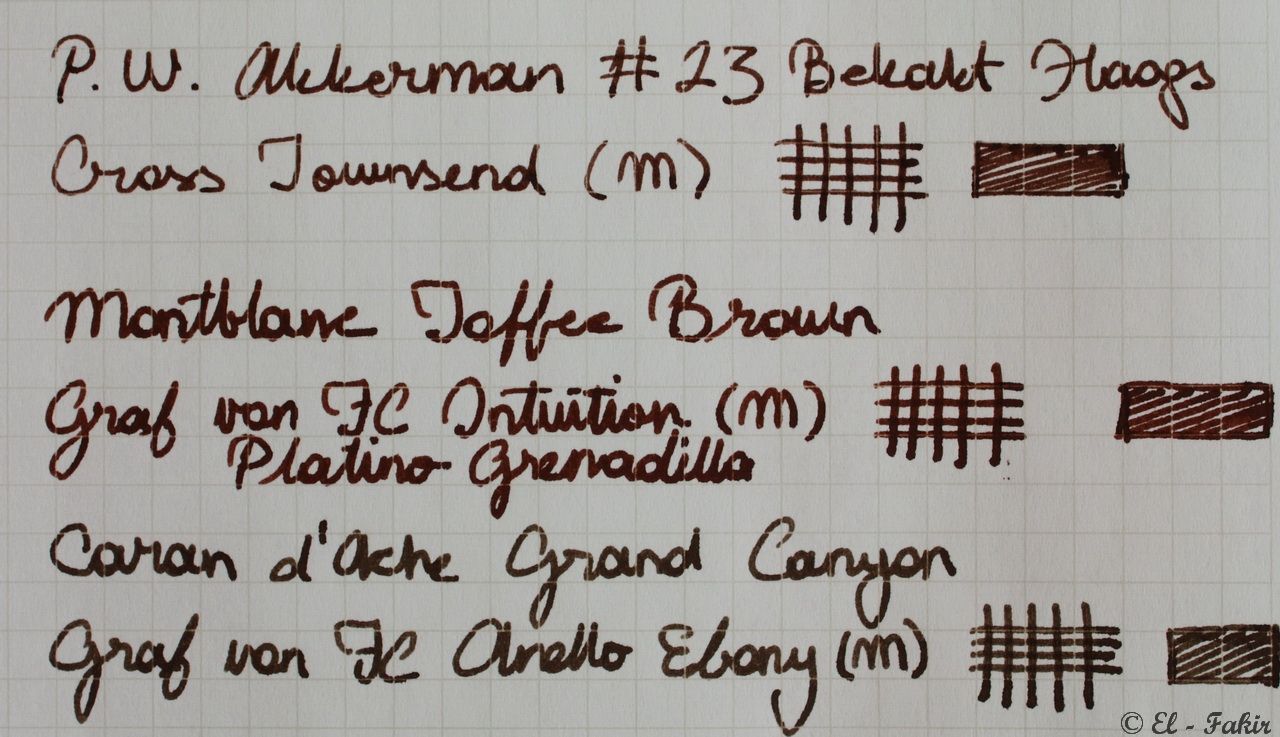
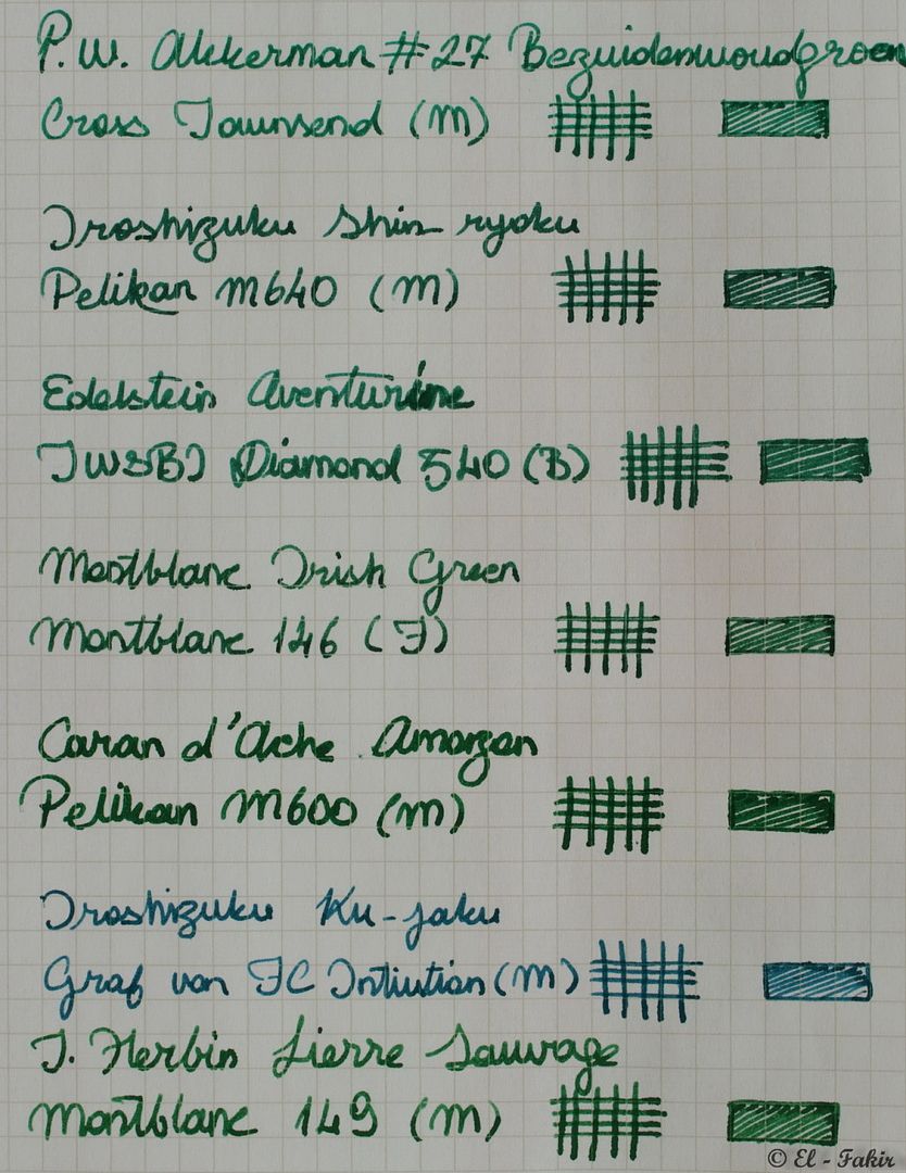
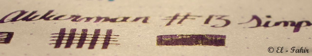
    From L to R: #05 Shocking Blue, #11 Trêves-Turquoise, #27 Bezuidenwoudgroen, #23 Bekakt Haags, #13 Simplisties Violet, #16 Oranje Boven and #22 Hopjesbruin

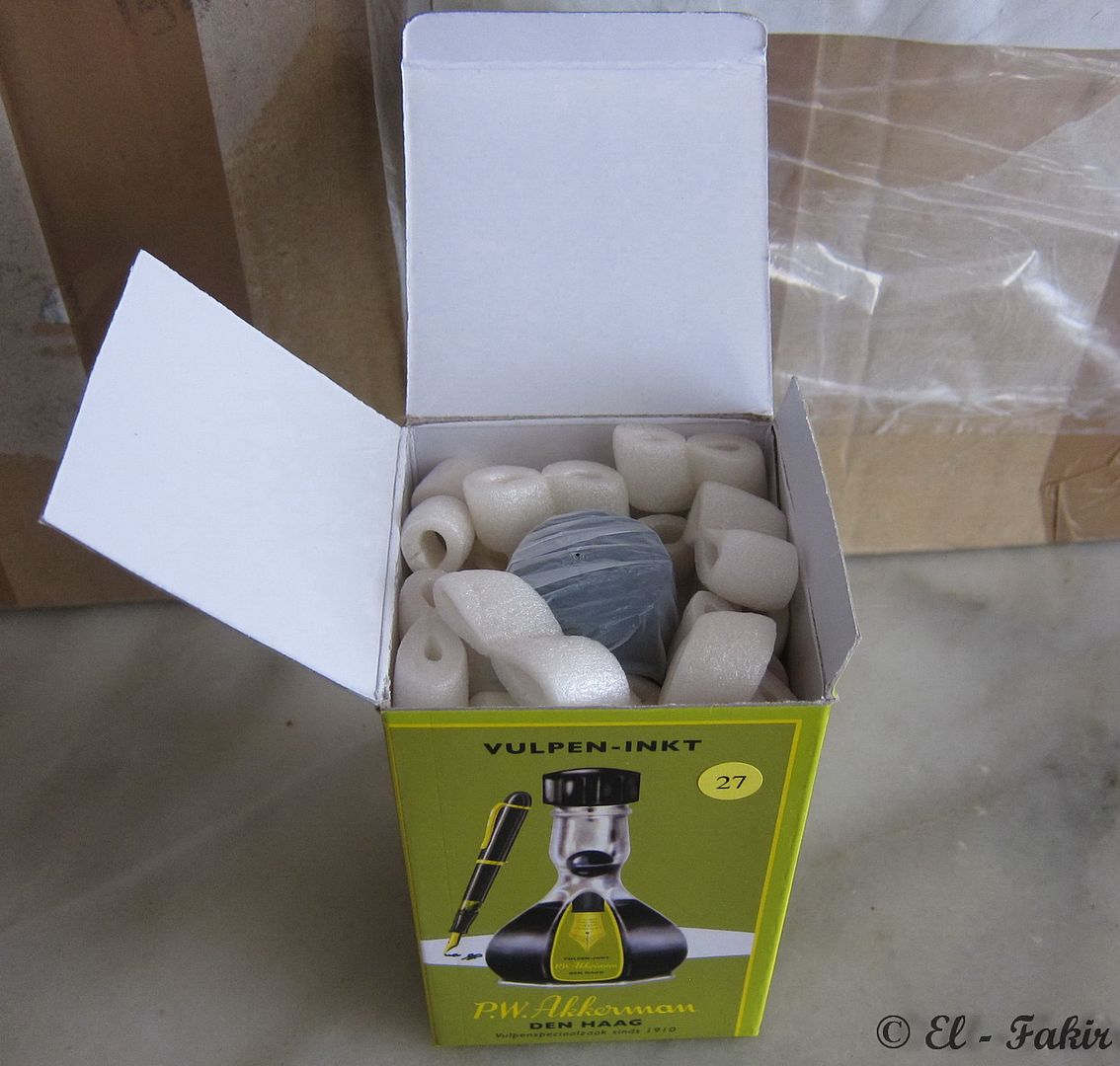
    I have to say that I wasn't really impressed that much with build quality of the bottles. Yes, it is a very beautiful vintage design offering an ingenious, yet simple, solution to let you fill your pen with ease no matter how much ink is left in the bottle (for those of you who don’t know, I’m talking about the little marble that traps the ink in the upper section and thus always provides you a convenient deep well of ink). Nevertheless, the overall quality of the bottle, especially the plastic cap, leaves much to desire. I guess I’ve been spoiled too much by excellent build qualities of other bottles from Iroshizuku, Montblanc, Edelstein or Caran d'Ache.


    Let's talk about the ink then. As I said, that's what matters most, isn't it?
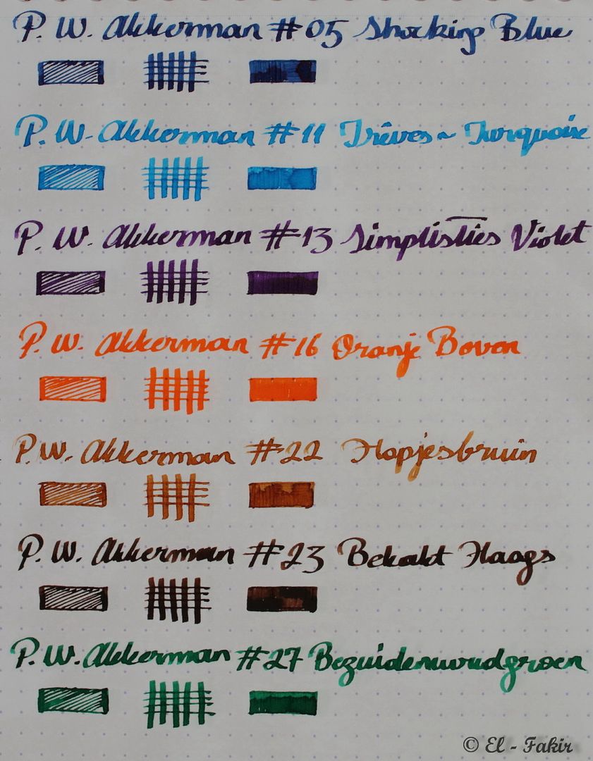
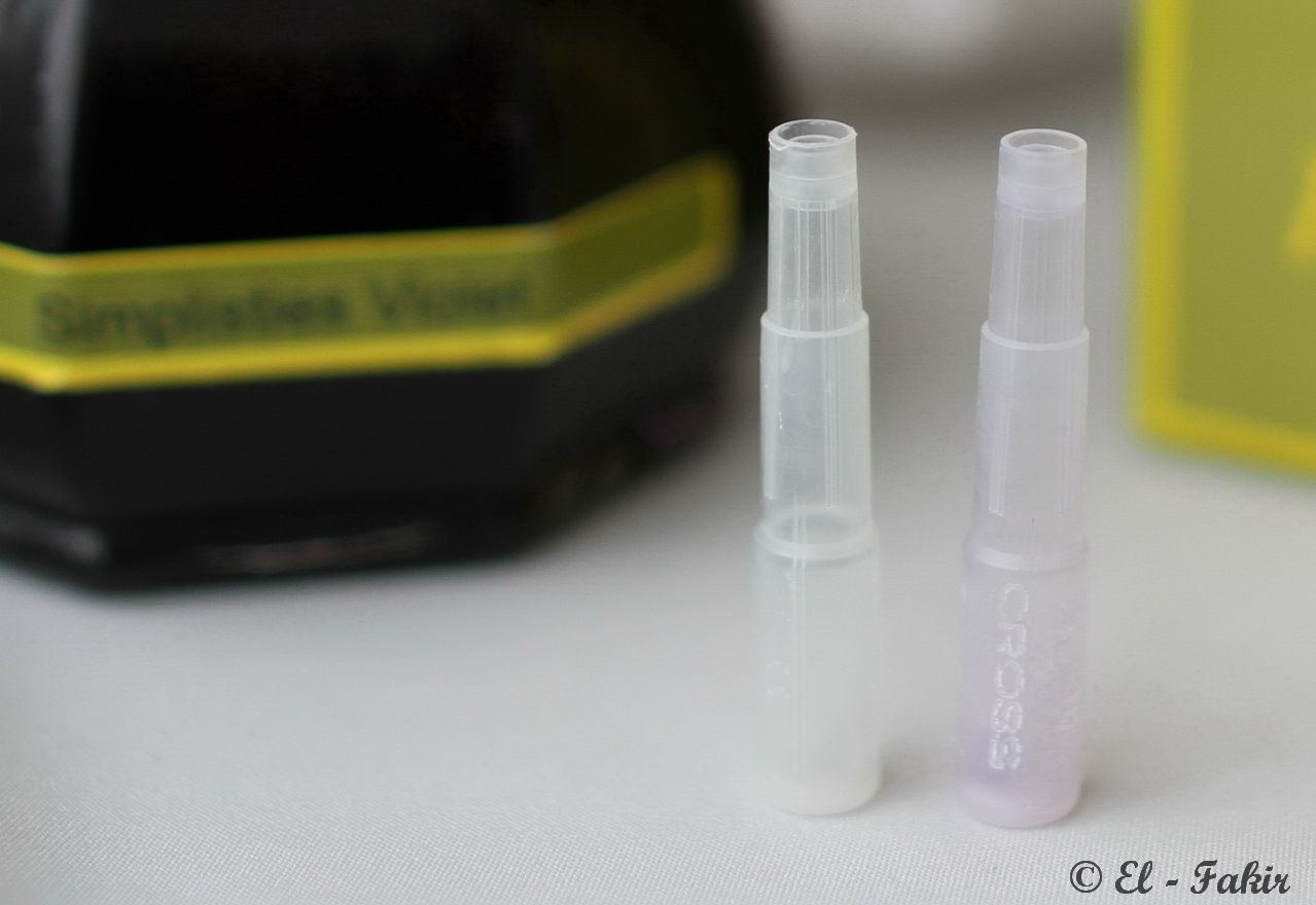
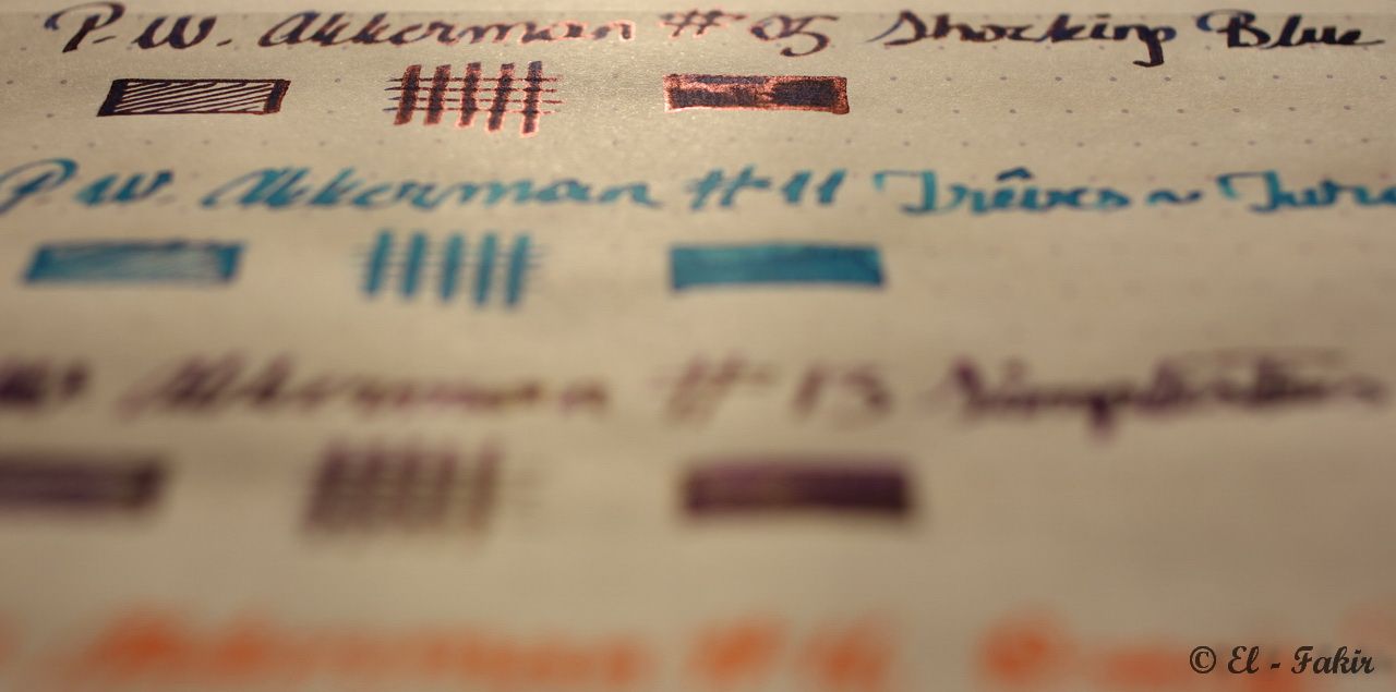
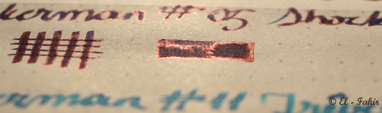
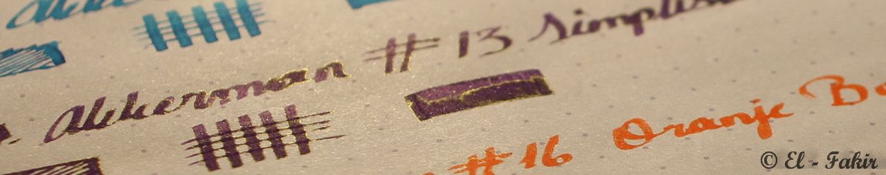
    I’ve prepared two sheets of sample writing; one on Rhodia DotPad 80gsm papper with TWSBI 540 (1.5mm – widest nib available to me at the moment) and the other on a very absorbent Koza (a Turkish paper brand) 80gsm grid paper with Cross Townsend (M – one of my thinnest nibs).


    Now, if you promise to excuse my very poor handwriting here’s those sheets;


    written with TWSBI 540 (1.5mm) on Rhodia DotPad (80gsm)


    written with Cross Townsend (M) on Koza Grid Paper(80gsm)


    Before we move onto the comparison sheets of these P.W. Akkerman inks with other inks I have in my inventory, I must apologize for the fact that;
    1. I didn’t use a better quality paper for these comparisons. (Such a paper could demonstrate the true colours and shading properties of inks much better than the absorbent paper I used. I just started using this paper without giving it much thought and it didn’t occur to me until it’s too late that, for instance Rhodia dot paper (duh!) would be more suitable for the task.)

    2. I didn’t use the same pen for each ink because I couldn’t take up the challenge of doing all that tedious work required to fill the pen, write the sample, flush the pen, clean it and fill it again for every ink.


    However, I’m just about to start a whole new ink journal and as soon as I record all of my inks I'm going to post here additional comparisons. This time it will be done in the proper way, though.

    (continued in the next post...)
    Regards, Halid

  2. The Following 2 Users Say Thank You to halidak For This Useful Post:

    dannzeman (October 24th, 2014)

  3. #2
    Junior Member halidak's Avatar
    Join Date
    Jul 2012
    Location
    Ankara, Turkey
    Posts
    13
    Thanks
    0
    Thanked 40 Times in 8 Posts
    Rep Power
    0

    Default

    (...continued from the previous post)

    Until then, I hope these samples can give you at least a rough idea about where these P.W. Akkerman inks stand compared to some other inks.


    My overall experience with all of these P.W. Akkerman inks is quite satisfactory. They;
    • have enough saturation, for me at least,
    • flow well (not too wet and definitely not dry) out of all the nibs I tried,
    • behave very nicely on even cheap paper (except #05 Shocking Blue which has a slight tendency to bleed-through) and
    • can be washed away fairly easily (except #13 Simplisties Violet which has slightly stained the cartridge I used it in. Vide infra)


    I used #13 Simplisties Violet in the cartridge on the right and, as you can see, it has left a slight stain on it. Barely noticeable but it's there.
    It is not enough, though, to discourage me not to use it because I absolutely loved the pure and vibrant violet colour of this ink.


    One last thing to note is that both #05 Shocking Blue and #13 Simplisties Violet are one of those inks that exhibit some sheen under certain lighting conditions, as I tried to show in the following pictures;


    (continued in the next post...)
    Regards, Halid

  4. The Following 7 Users Say Thank You to halidak For This Useful Post:

    Ahriman4891 (June 2nd, 2019), ceebert (July 24th, 2019), dannzeman (October 24th, 2014), EHV (September 12th, 2016), Pterodactylus (May 4th, 2013), Strombomboli (February 17th, 2014)

  5. #3
    PeterLLLLLL
    Guest

    Default

    Your writting are very beautiful...I think the ink is very importmant....Can you tell me where to buy it...

  6. #4
    Junior Member halidak's Avatar
    Join Date
    Jul 2012
    Location
    Ankara, Turkey
    Posts
    13
    Thanks
    0
    Thanked 40 Times in 8 Posts
    Rep Power
    0

    Default

    Thank you all for your kind comments.
    I hope this can be helpful in any way to other inkaholics out there in their never-ending quest for more and more ink.
    Regards, Halid

  7. #5
    Junior Member halidak's Avatar
    Join Date
    Jul 2012
    Location
    Ankara, Turkey
    Posts
    13
    Thanks
    0
    Thanked 40 Times in 8 Posts
    Rep Power
    0

    Default

    Quote Originally Posted by PeterLLLLLL View Post
    Your writting are very beautiful...I think the ink is very importmant....Can you tell me where to buy it...
    Hi,

    There is no distributor for these inks anywhere in the world and your only option is to directly order from the shop P.W. Akkerman in The Hague, Netherland.

    This is the link for P.W. Akkerman's Webstore

    They accept PayPal but the main concern is the shipping costs. For your information, they charge three different fixed shipping fees according the number of bottles you order.
    That’s, X Euro for 1-3 bottles, Y Euro for 4-7 bottles and Z Euro for 8-15 bottles. Therefore, it does not matter whether you order 4 bottles or 7. You pay Y Euro for shipping in either case.
    You can learn these costs through their website.
    Last edited by halidak; November 29th, 2012 at 06:45 AM. Reason: Added 'The' before 'Hague'
    Regards, Halid

  8. #6
    Senior Member FredRydr's Avatar
    Join Date
    Sep 2012
    Location
    Carlisle, Pennsylvania USA
    Posts
    4,930
    Thanks
    1,405
    Thanked 6,441 Times in 2,523 Posts
    Rep Power
    18

    Default Seven New (to me) P.W. Akkerman Inks

    Quote Originally Posted by halidak View Post
    My overall experience with all of these P.W. Akkerman inks is quite satisfactory...except #05 Shocking Blue which has a slight tendency to bleed-through....
    A search in the forum for Akkerman No. 5 "Shocking Blue" brought little result, so I've posted in this old thread.

    I decided to empty and clean my Minimalistica of Diamine Sargasso Sea and fill with Akkerman No. 5 "Shocking Blue" because they are similar in appearance, color and sheen. While the former is more of a chore to clean from a pen, the latter is more prone to feather and bleed on the same paper. I'll try sticking with No. 5 for a few fills, but I'll have to be more selective with stationary and cards (especially vintage postcards).
    Last edited by FredRydr; June 4th, 2019 at 10:08 AM.

  9. #7
    Senior Member FredRydr's Avatar
    Join Date
    Sep 2012
    Location
    Carlisle, Pennsylvania USA
    Posts
    4,930
    Thanks
    1,405
    Thanked 6,441 Times in 2,523 Posts
    Rep Power
    18

    Default Re: Seven New (to me) P.W. Akkerman Inks

    I wish to add that today's dump of Akkerman No. 5 "Shocking Blue" (from a Conid Minimalistica's loose nib and feed) resisted but finally succumbed to generous applications of Reduran and Amodex. I should have taken a photo.

  10. The Following User Says Thank You to FredRydr For This Useful Post:

    CrayonAngelss (November 11th, 2020)

  11. #8
    Junior Member halidak's Avatar
    Join Date
    Jul 2012
    Location
    Ankara, Turkey
    Posts
    13
    Thanks
    0
    Thanked 40 Times in 8 Posts
    Rep Power
    0

    Default

    (...continued from the previous post)

    So, which one is my favourite?

    #16 Oranje Boven is a strong contender as I love orange/saffron inks and this one is the most vibrant of all the others I’ve ever tried,


    but in the end I love blue the most and as a turquoise ink fan it shouldn't be a surprise that #11 Trêves-Turquoise is my favourite one.
    It is not only my favourite among these seven P.W. Akkerman inks but also my all-time favourite among all the inks I have at the moment.


    (The End)
    Regards, Halid

  12. The Following 5 Users Say Thank You to halidak For This Useful Post:

    dannzeman (October 24th, 2014), Entre2tierras (July 3rd, 2019), jodylud (May 2nd, 2016), Strombomboli (February 17th, 2014)

  13. #9
    The Nibsmith dannzeman's Avatar
    Join Date
    Jan 2010
    Location
    IOWA -- Go HAWKEYES!!
    Posts
    1,244
    Thanks
    524
    Thanked 1,837 Times in 439 Posts
    Rep Power
    16

    Default

    Quote Originally Posted by halidak View Post
    I'm terribly sorry about the images if they are just too big for you.
    No worries. I like big images and I cannot lie.

    Also, AMAZINGLY AWESOME POST!

  14. #10
    Junior Member TonicLime's Avatar
    Join Date
    Feb 2012
    Location
    WA State
    Posts
    19
    Thanks
    0
    Thanked 0 Times in 0 Posts
    Rep Power
    0

    Default

    Nice Review! The ORnje Boven looks like an awesome ink. Thanks for sharing with us your new inks

  15. #11
    Senior Member Scrawler's Avatar
    Join Date
    Mar 2013
    Location
    Canada
    Posts
    1,265
    Thanks
    1,839
    Thanked 1,254 Times in 562 Posts
    Rep Power
    13

    Default Re: Seven New (to me) P.W. Akkerman Inks

    Quote Originally Posted by TonicLime View Post
    Nice Review! The ORnje Boven looks like an awesome ink. Thanks for sharing with us your new inks
    I wonder how many people know the actual significance of Oranje Boven.

    oranjeboven.jpg

  16. #12
    Senior Member Sailor Kenshin's Avatar
    Join Date
    Apr 2012
    Location
    Where pigs run free!
    Posts
    4,022
    Thanks
    6,335
    Thanked 3,493 Times in 1,751 Posts
    Rep Power
    18

    Default

    Quote Originally Posted by dannzeman View Post
    No worries. I like big images and I cannot lie.

    Also, AMAZINGLY AWESOME POST!
    Hear, hear! What a great job.
    My other pen is a Montblanc.

    And my other blog is a tumblr!


    And my latest ebook, for spooky wintery reading:

    https://www.amazon.com/gp/product/B0CM2NGSSD

  17. #13
    Junior Member halidak's Avatar
    Join Date
    Jul 2012
    Location
    Ankara, Turkey
    Posts
    13
    Thanks
    0
    Thanked 40 Times in 8 Posts
    Rep Power
    0

    Default

    Quote Originally Posted by Sailor Kenshin View Post
    Hear, hear! What a great job.
    Thank you! I'm glad you liked it.
    Regards, Halid

  18. #14
    Senior Member Robert's Avatar
    Join Date
    Oct 2012
    Location
    Houston, TX
    Posts
    654
    Thanks
    1,196
    Thanked 406 Times in 290 Posts
    Rep Power
    12

    Default

    Another vote for #23. And the Shocking Blue is also quite nice. Thanks for all of your efforts in putting the review together.

  19. #15
    Senior Member writingrav's Avatar
    Join Date
    Jan 2012
    Location
    Philadelphia
    Posts
    2,191
    Thanks
    768
    Thanked 1,297 Times in 543 Posts
    Rep Power
    15

    Default

    Thanks so much. Sure wish these were easier to come by in the states.

  20. #16
    FP_GaF
    Guest

    Default

    Wow, niiice!

    Heck of job. Well done. This is a very nice overview/review/comparison of seven very interesting inks. If it IS true that the inks are really made by Diamine then I am not surprised about their good performance. I love Diamine ink and since I live in the UK I can get all their colours easily.

    Would be nice to see if we can find the same colours in Diamine's regular product line unless these inks are custom made exclusively for Ackermann.

    Thanks for the nice post(s).

  21. #17
    Senior Member Bogon07's Avatar
    Join Date
    Feb 2012
    Location
    Sydney, Terra Australis
    Posts
    2,830
    Thanks
    4,859
    Thanked 1,764 Times in 808 Posts
    Rep Power
    15

    Default

    Halidak,
    Thanks for a such a detailed and thorough review of your Ackermann inks.
    Great pictures and a lot of information.
    Also some very helpful comparisons and will make a very handy reference.

    Oranje Boven appears to be an incredibly intense poke-you-in-the-eye orange although not much of a shader.
    sinistral hypergraphica - a slurry of ink
    "Nothing means less than zero"

  22. #18
    Senior Member melissa59's Avatar
    Join Date
    May 2012
    Location
    Southern California
    Posts
    106
    Thanks
    0
    Thanked 3 Times in 1 Post
    Rep Power
    12

    Default

    Nice!
    If we ever get together for a group purchase, Turquoise would be my #1 Akkerman choice, too.
    I also like Hopjesbruin. A nice brown!

  23. #19
    Junior Member
    Join Date
    May 2012
    Posts
    5
    Thanks
    0
    Thanked 0 Times in 0 Posts
    Rep Power
    0

    Default

    Well, there's 6 more inks on my want to buy list! Great review full of good pics!

  24. #20
    FPG Donor ♕ KrazyIvan's Avatar
    Join Date
    Feb 2012
    Location
    Texas-USA
    Posts
    5,068
    Thanks
    1,476
    Thanked 1,798 Times in 943 Posts
    Rep Power
    20

    Default

    I love the bottles and #23 is particularly nice looking on my monitor. 
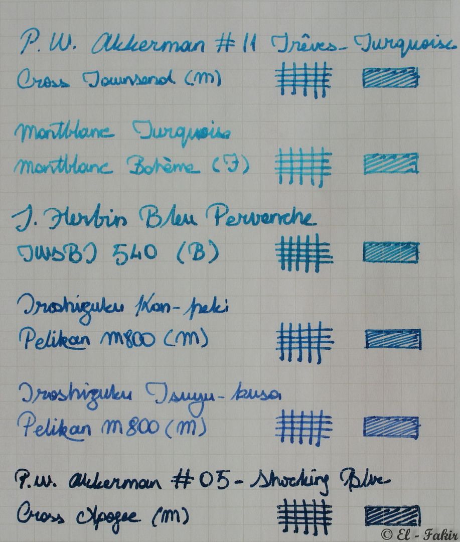
Oh, so is that Montblanc.
    Fountain Pen Sith Lord | Daakusaido | Everything in one spot

Tags for this Thread

Bookmarks

Posting Permissions

  • You may not post new threads
  • You may not post replies
  • You may not post attachments
  • You may not edit your posts
  •