Page 2 of 2 FirstFirst 12
Results 21 to 30 of 30

Thread: Studios

  1. #21
    Junior Member
    Join Date
    Jul 2012
    Posts
    3
    Thanks
    0
    Thanked 1 Time in 1 Post
    Rep Power
    0

    Default

    A few things to contribute here:

    1) The new "Royal Red" LE is not very red, IMHO. It looks quite orange/coppery to me. Very pretty, just not red! Hopefully our pictures reflect that correctly, we try to color-adjust everything to make it as accurate to real life as possible.
    2) They did switch from more of a royal blue (Blue, L67BE) to a navy blue (Imperial Blue, L67IB). Here's a picture comparison and video too: http://www.gouletpens.com/Articles.asp?ID=334

    Hope that helps!

  2. The Following User Says Thank You to MrsGouletPens For This Useful Post:

    ThriveToScribe (July 27th, 2013)

  3. #22
    Senior Member Bogon07's Avatar
    Join Date
    Feb 2012
    Location
    Sydney, Terra Australis
    Posts
    2,830
    Thanks
    4,859
    Thanked 1,764 Times in 808 Posts
    Rep Power
    15

    Default

    Quote Originally Posted by MrsGouletPens View Post
    A few things to contribute here:

    1) The new "Royal Red" LE is not very red, IMHO. It looks quite orange/coppery to me. Very pretty, just not red! Hopefully our pictures reflect that correctly, we try to color-adjust everything to make it as accurate to real life as possible.
    2) They did switch from more of a royal blue (Blue, L67BE) to a navy blue (Imperial Blue, L67IB). Here's a picture comparison and video too: http://www.gouletpens.com/Articles.asp?ID=334

    Hope that helps!
    MrsGouletPens,
    Your site is one of the few to accurately reflect the colour of the new Imperial Blue Studio just about everyone else seems to have used Lamy's overbright stock photo to portray this pen. It was quite a shock to see the actual dark navy colour of one in a shop, I can imagine the surprise of anyone who bought one based on the colour shown on most sites especially eBay and other on-line pen retailers..
    sinistral hypergraphica - a slurry of ink
    "Nothing means less than zero"

  4. #23
    Junior Member ballboy's Avatar
    Join Date
    Oct 2012
    Posts
    3
    Thanks
    19
    Thanked 1 Time in 1 Post
    Rep Power
    0

    Default

    Out of the brushed steel and Palladium Studios I had, I preferred the rubber grip on the former. I had to be aware of the sharpness of the cap edge when capping the pen incase it caught and possibly cut the section. Nice pens with the right nib.
    Roger

    Magnanimity & pragmatism

  5. #24
    Senior Member Bogon07's Avatar
    Join Date
    Feb 2012
    Location
    Sydney, Terra Australis
    Posts
    2,830
    Thanks
    4,859
    Thanked 1,764 Times in 808 Posts
    Rep Power
    15

    Default

    The local city pen shop has the Royal Red Studio RollerBall & the Ballpoint. Red Red is visually a very striking and unique colour especially in the Studio's satin finish.
    Even taking into account the odd lighting in the shop the colour leans way more towards orange than red. More of an orange with a touch of red tint than the other way around.


    Montblanc Winter Glow Ink (2012) would go well with this fountain pen.
    Last edited by Bogon07; November 22nd, 2012 at 08:26 PM.
    sinistral hypergraphica - a slurry of ink
    "Nothing means less than zero"

  6. #25
    Senior Member Tony Rex's Avatar
    Join Date
    Jan 2013
    Location
    Melbourne, Australia
    Posts
    508
    Thanks
    596
    Thanked 652 Times in 243 Posts
    Rep Power
    12

    Default Re: Studios

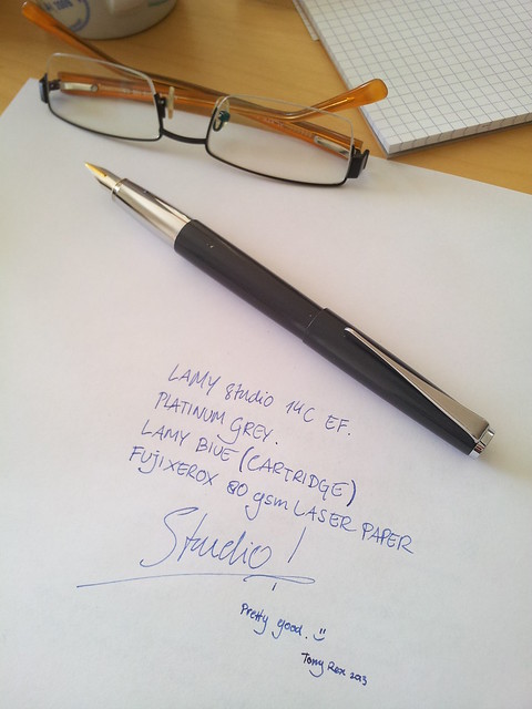
    Took this pic while refurbishing the Platinum Grey. It had had a rough life, with deep scratches, a loose clip, misaligned 14C tines, clogged with red ink, etc. But it responds well to TLC, now it's like new except for the battle scars.


    Here it is today.


    Tony

    Update: I ground the nib into XXF now. Cheers.
    Last edited by Tony Rex; August 3rd, 2013 at 07:28 AM. Reason: Added pic

  7. The Following User Says Thank You to Tony Rex For This Useful Post:

    Bogon07 (July 6th, 2013)

  8. #26
    Member CapeClear's Avatar
    Join Date
    Nov 2012
    Location
    Ireland
    Posts
    93
    Thanks
    123
    Thanked 27 Times in 25 Posts
    Rep Power
    12

    Default Re: Studios

    Lovely job Tony! That nib is gorgeous. I bought a stainless steel Studio in HK last week for the knockdown price of €25! I purchased it from a Lamy boutique that was closing down. I was a bit skeptical of its authenticity but it's the real deal. It came with a stainless nib of course but I've popped on a 1.5mm italic (my favourite Lamy nib). It's my new favourite pen! It's weighted perfectly for me (imported) and great for marathon writing sessions.

  9. The Following User Says Thank You to CapeClear For This Useful Post:

    Tony Rex (July 5th, 2013)

  10. #27
    Senior Member AtomicLeo's Avatar
    Join Date
    May 2013
    Location
    White Rock, New Mexico
    Posts
    139
    Thanks
    38
    Thanked 25 Times in 21 Posts
    Rep Power
    11

    Default Re: Studios

    I do like the Studios but have been turned off by the color choices. The Royal Red isn't red. The Imperial Blue is almost a matte black. I handled the older blue in my local store a few years ago, but passed it over for a Pilot Knight. Really, wished I had bought it, too. I like that older blue color.

  11. #28
    FPG Donor ♕ KrazyIvan's Avatar
    Join Date
    Feb 2012
    Location
    Texas-USA
    Posts
    5,068
    Thanks
    1,476
    Thanked 1,798 Times in 943 Posts
    Rep Power
    20

    Default Re: Studios

    I liked the black but it just got too heavy for my hand.
    Fountain Pen Sith Lord | Daakusaido | Everything in one spot

  12. #29
    Senior Member
    Join Date
    Apr 2013
    Posts
    273
    Thanks
    134
    Thanked 109 Times in 67 Posts
    Rep Power
    12

    Default Re: Studios

    I bought the brushed steel version because of the rubberized grip. I really like it especially with the 1.1 italic nib.

  13. #30
    Senior Member Bogon07's Avatar
    Join Date
    Feb 2012
    Location
    Sydney, Terra Australis
    Posts
    2,830
    Thanks
    4,859
    Thanked 1,764 Times in 808 Posts
    Rep Power
    15

    Default Re: Studios

    Quote Originally Posted by AtomicLeo View Post
    I do like the Studios but have been turned off by the color choices. The Royal Red isn't red. The Imperial Blue is almost a matte black. I handled the older blue in my local store a few years ago, but passed it over for a Pilot Knight. Really, wished I had bought it, too. I like that older blue color.
    It is not too late, you can still get one from the ColnGallery UK http://www.colnart.com/collections/l...e-fountain-pen
    sinistral hypergraphica - a slurry of ink
    "Nothing means less than zero"

Bookmarks

Posting Permissions

  • You may not post new threads
  • You may not post replies
  • You may not post attachments
  • You may not edit your posts
  •