Page 9 of 11 FirstFirst ... 7891011 LastLast
Results 161 to 180 of 219

Thread: Mystery Ink No. 7

  1. #161
    Senior Member Sammyo's Avatar
    Join Date
    Oct 2014
    Location
    Tochigi, Japan
    Posts
    884
    Thanks
    570
    Thanked 785 Times in 312 Posts
    Rep Power
    10

    Default Re: Mystery Ink No. 7

    Quote Originally Posted by Cob View Post
    I wonder if there is a climactic element to this - in particular temperature and relative humidity.

    C.
    Interesting... We had just had a number of downpours plus some humidity in the air. Also as I said it was worse yesterday and it was definitely more humid then.

    Also scratch my comment about No.18 Rhodia paper, my brain caught up with my eyes and I am now back on track. Sorry for the silly question
    Last edited by Sammyo; May 5th, 2015 at 04:10 PM.
    Sam O

    "A fountain pen with a bad nib is like a Ferrari with a flat tyre..." - Brian Gray, Edison pens

  2. #162
    Senior Member Sammyo's Avatar
    Join Date
    Oct 2014
    Location
    Tochigi, Japan
    Posts
    884
    Thanks
    570
    Thanked 785 Times in 312 Posts
    Rep Power
    10

    Default Re: Mystery Ink No. 7

    Quote Originally Posted by Laura N View Post
    ... Maybe Sammyo's sample was the very last one made, and maybe he's experiencing a little of that spread as a result? Could there have been a few particles or something at the very bottom? I have no idea, just a thought...
    I have to be honest... I have not yet reached the bottom of a bottle of ink so I have no point of reference! lol
    I have heard that the end of a bottle acts differently to the start. The list of variables grows! Pen, nib, feed, paper, location, weather, where from the bottle, quality of pen cleaning, writing pressure, etc...

    As an engineer I love this stuff
    Sam O

    "A fountain pen with a bad nib is like a Ferrari with a flat tyre..." - Brian Gray, Edison pens

  3. The Following 2 Users Say Thank You to Sammyo For This Useful Post:

    Laura N (May 5th, 2015), Sailor Kenshin (May 5th, 2015)

  4. #163
    Senior Member
    Join Date
    Mar 2015
    Location
    Small town, AB, CAN
    Posts
    669
    Thanks
    715
    Thanked 131 Times in 66 Posts
    Rep Power
    10

    Default Re: Mystery Ink No. 7

    I always shake the bottle...

  5. #164
    Senior Member Sammyo's Avatar
    Join Date
    Oct 2014
    Location
    Tochigi, Japan
    Posts
    884
    Thanks
    570
    Thanked 785 Times in 312 Posts
    Rep Power
    10

    Default Re: Mystery Ink No. 7

    Quote Originally Posted by BCDDiggler View Post
    I always shake the bottle...
    Sam O

    "A fountain pen with a bad nib is like a Ferrari with a flat tyre..." - Brian Gray, Edison pens

  6. The Following 3 Users Say Thank You to Sammyo For This Useful Post:

    Cob (May 5th, 2015), Crazyorange (May 6th, 2015), Laura N (May 5th, 2015)

  7. #165
    Senior Member Laura N's Avatar
    Join Date
    Oct 2012
    Location
    Chicagoland
    Posts
    2,071
    Thanks
    1,519
    Thanked 2,593 Times in 1,021 Posts
    Rep Power
    14

    Default Re: Mystery Ink No. 7

    Okay, MI7.

    Thank you to all the participants. I've used this ink for two years and I don't think I noticed as much about it in all that time as I did reading your reactions. Plus, now I know what "spread" means.

    Also, thank you to the people who emailed me their excellent guesses. There were three brave guessers.

    One guess was De Atramentis Fog Grey. By coincidence I got a letter with Fog Grey a few days later. It’s a lovely blue gray ink, which is almost more blue to my eyes than gray. Note that this guesser wasn’t actually an MI7 recipient so she was guessing from how the inks looked online. And perhaps she remembers that I like DA ink.

    Another guess was Diamine Eclipse. This was guess I found fascinating for entirely personal reasons. Because Diamine Eclipse happens to be an ink that I loathe. I've hated it from the first, entirely without reason or rationale. To my memory it's very dark purple. It reminded me of Victorian crepe and almost physically repulsed me. There must have been some scary incident in my childhood that accounts for that, but luckily I’ve repressed the details since I can't afford years of therapy. And now, thanks to MI7, I find I may have to temper my reaction to Eclipse. This guess submitted by someone who knows more about ink than almost anyone I know. So it seems that this ink I dislike might have something in common with an ink I like. Sigh.

    The last guess, by Sammyo’s group, was Graf von Faber-Castell Stone Grey. Here’s a swab online. I think Sammyo's group may be onto something. This looks like it could be close.

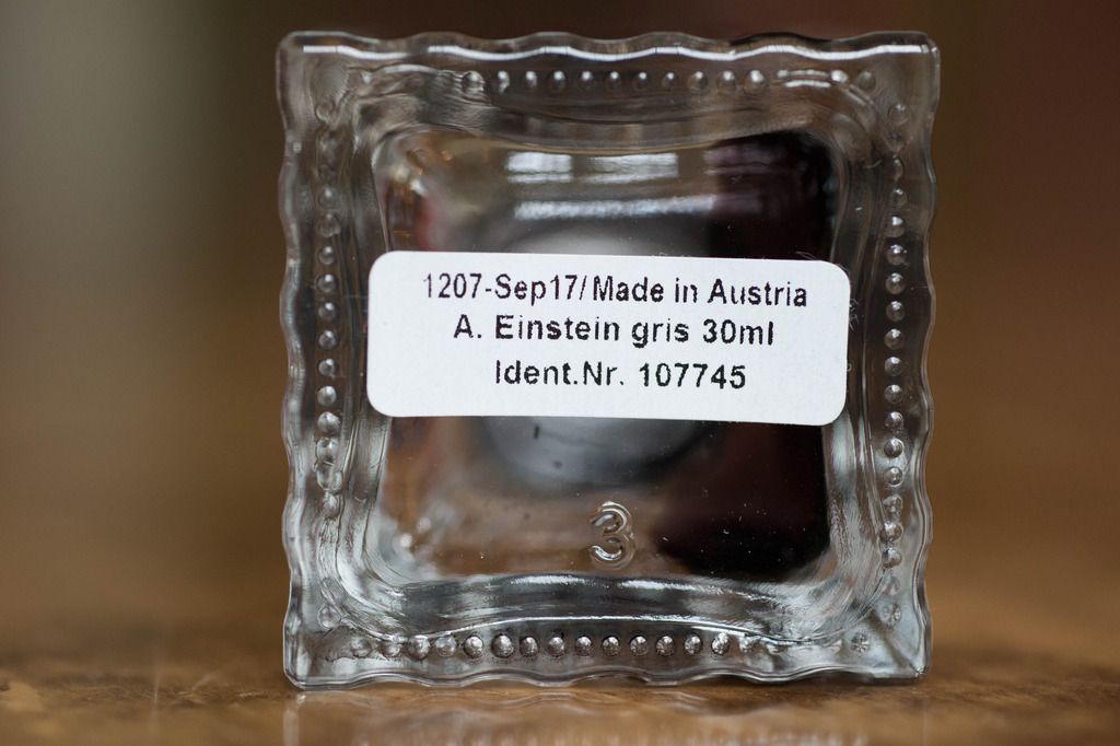
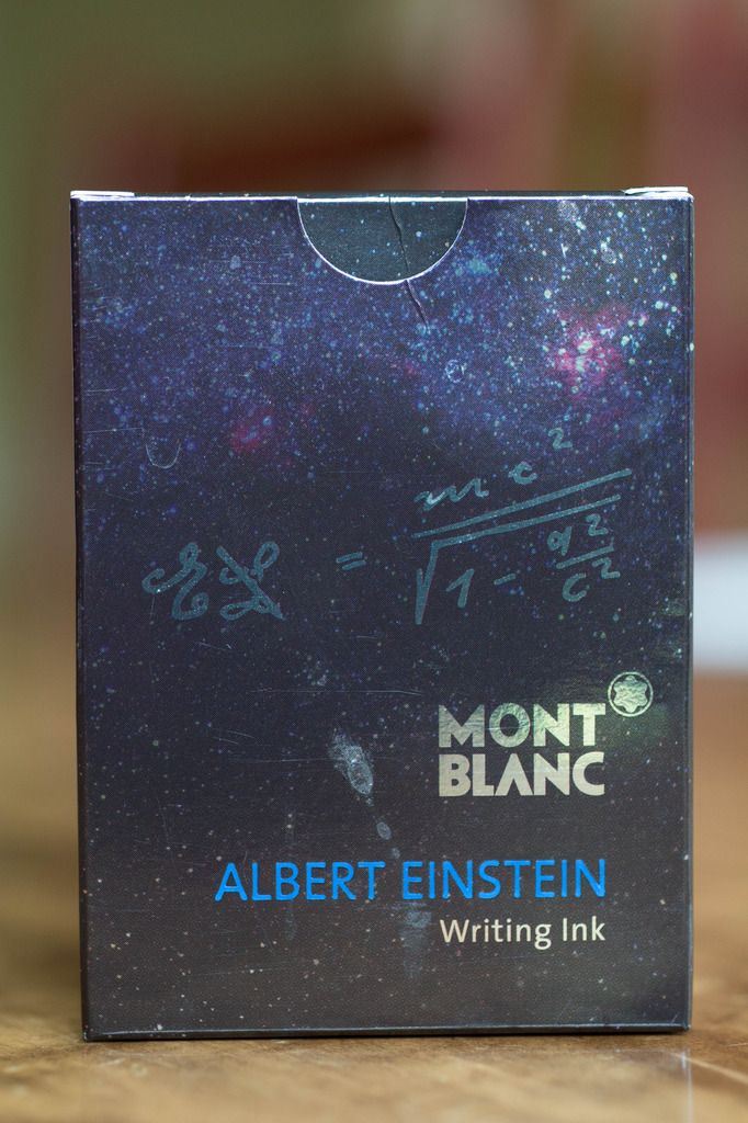
    It could be a nice alternative ink, at least. Because MI7 was Montblanc’s Albert Einstein ink. Montblanc considers it gray, not black.


    Elaineb pointed out how carefully she thinks the ink was composed, and that’s a feeling it’s always given me, too. After reading all these excellent write-ups about MI7, and hearing about the purple tint, which I probably never even noticed before, I'm looking at it more carefully. Now that I think about it, even the box, which uses a black-gray-purple photo of outer space as the blackboard-like background for Einstein’s equations, ties in with the ink color.


    All that aside, for me, it’s an ink I just loved writing with. I like a dry ink that shades, and a less saturated ink, and don’t like bright inks for most things. So unsurprisingly Albert Einstein worked perfectly for me. I use it in wet pens, like Montblancs, Parkers and Pelikans, so the dry quality is an asset with my pens. Overall I find it an interesting dark gray that can look different with different nibs, but always remains easy to read. It’s been a nice alternative to black ink for me. In fact, I used it extensively at a time when I didn’t want to use black ink. I could use it for work without problem, or in notes and letters. I will admit that I’m an outlier on these fountain pen boards when it comes to ink. I like quieter colors. I find them calm and soothing. I also like zen rock gardens. So I may be boring, but I’m consistent.

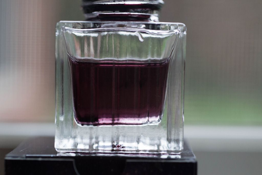
    I'll leave you with a photo taken after I put water in the empty bottle to clean it. There is the purple tint you all found.


  8. The Following 13 Users Say Thank You to Laura N For This Useful Post:

    + Show/Hide list of the thanked

    akapulko2020 (May 5th, 2015), BCDDiggler (May 5th, 2015), Chrissy (May 6th, 2015), Cob (May 5th, 2015), Crazyorange (May 6th, 2015), elaineb (May 6th, 2015), inlovewithjournals (May 6th, 2015), Jon Szanto (May 5th, 2015), Neo (May 5th, 2015), reprieve (May 5th, 2015), Sailor Kenshin (May 5th, 2015), Sammyo (May 5th, 2015), Uncle Bud (May 6th, 2015)

  9. #166
    Senior Member Jon Szanto's Avatar
    Join Date
    Feb 2012
    Posts
    6,639
    Thanks
    7,810
    Thanked 11,107 Times in 4,027 Posts
    Rep Power
    22

    Default Re: Mystery Ink No. 7

    Damn.
    "When Men differ in Opinion, both Sides ought equally to have the Advantage of being heard by the Publick;
    and that when Truth and Error have fair Play, the former is always an overmatch for the latter."

    ~ Benjamin Franklin

  10. #167
    Senior Member Laura N's Avatar
    Join Date
    Oct 2012
    Location
    Chicagoland
    Posts
    2,071
    Thanks
    1,519
    Thanked 2,593 Times in 1,021 Posts
    Rep Power
    14

    Default Re: Mystery Ink No. 7

    Quote Originally Posted by Jon Szanto View Post
    Damn.
    How so?

  11. #168
    Senior Member Sammyo's Avatar
    Join Date
    Oct 2014
    Location
    Tochigi, Japan
    Posts
    884
    Thanks
    570
    Thanked 785 Times in 312 Posts
    Rep Power
    10

    Default Re: Mystery Ink No. 7

    Ha ha ha... It's so funny that the group agreed on Graf von Faber-Castell Stone Grey (Thanks to naimitsu for the hard work with the dip pen and experience)... but I made an of hand joke comment along the lines of "... But it's usually a Montblanc ink that you can't get anymore! Ha ha ha!"

    I honestly really liked this ink. I was planning to try some greys at some point, like kiri-same and fuyu-syogun or De Atramentis silver grey... but now I am ruined
    Sam O

    "A fountain pen with a bad nib is like a Ferrari with a flat tyre..." - Brian Gray, Edison pens

  12. #169
    Senior Member Jon Szanto's Avatar
    Join Date
    Feb 2012
    Posts
    6,639
    Thanks
    7,810
    Thanked 11,107 Times in 4,027 Posts
    Rep Power
    22

    Default Re: Mystery Ink No. 7

    Quote Originally Posted by Laura N View Post
    Quote Originally Posted by Jon Szanto View Post
    Damn.
    How so?
    "When Men differ in Opinion, both Sides ought equally to have the Advantage of being heard by the Publick;
    and that when Truth and Error have fair Play, the former is always an overmatch for the latter."

    ~ Benjamin Franklin

  13. The Following 5 Users Say Thank You to Jon Szanto For This Useful Post:

    akapulko2020 (May 5th, 2015), Chrissy (May 6th, 2015), Cob (May 6th, 2015), Crazyorange (May 6th, 2015), Uncle Bud (May 6th, 2015)

  14. #170
    Senior Member migo984's Avatar
    Join Date
    Sep 2013
    Location
    Global Nomad
    Posts
    2,621
    Thanks
    622
    Thanked 3,155 Times in 1,103 Posts
    Rep Power
    13

    Default Re: Mystery Ink No. 7

    Quote Originally Posted by Jon Szanto View Post
    Damn.
    Kobe #31 Kaigon Stone Grey is close to Einstein but is very slightly darker and an altogether superior grey IMO. Although not cheap, it is less expensive than MI7 and probably easier to obtain these days.

  15. The Following 2 Users Say Thank You to migo984 For This Useful Post:

    akapulko2020 (May 5th, 2015), Jon Szanto (May 5th, 2015)

  16. #171
    Senior Member Sammyo's Avatar
    Join Date
    Oct 2014
    Location
    Tochigi, Japan
    Posts
    884
    Thanks
    570
    Thanked 785 Times in 312 Posts
    Rep Power
    10

    Default Re: Mystery Ink No. 7

    Honestly, you should try Graf von Faber-Castell Stone Grey
    Sam O

    "A fountain pen with a bad nib is like a Ferrari with a flat tyre..." - Brian Gray, Edison pens

  17. #172
    Senior Member reprieve's Avatar
    Join Date
    Apr 2013
    Location
    just a little bird floating on a hurricane
    Posts
    958
    Thanks
    1,791
    Thanked 987 Times in 439 Posts
    Rep Power
    12

    Default Re: Mystery Ink No. 7

    Quote Originally Posted by Sammyo View Post
    Honestly, you should try Graf von Faber-Castell Stone Grey
    +1. That's what I thought MI7 was!

  18. The Following User Says Thank You to reprieve For This Useful Post:

    Sammyo (May 5th, 2015)

  19. #173
    Senior Member Cob's Avatar
    Join Date
    Jun 2014
    Location
    Berkshire, England
    Posts
    1,546
    Thanks
    2,013
    Thanked 1,708 Times in 641 Posts
    Rep Power
    11

    Default Re: Mystery Ink No. 7

    Quote Originally Posted by Sammyo View Post
    Honestly, you should try Graf von Faber-Castell Stone Grey

    I just looked up that one: £25 a bottle!! too strong for me.

    Incidentally while looking, I saw an ad for Montblanc Lavender purple - £89!! What's going on with these inks?

    Cob

  20. The Following User Says Thank You to Cob For This Useful Post:

    akapulko2020 (May 6th, 2015)

  21. #174
    Senior Member Jon Szanto's Avatar
    Join Date
    Feb 2012
    Posts
    6,639
    Thanks
    7,810
    Thanked 11,107 Times in 4,027 Posts
    Rep Power
    22

    Default Re: Mystery Ink No. 7

    Quote Originally Posted by Cob View Post
    I just looked up that one: £25 a bottle!! too strong for me.
    I'm guessing you won't pop for the $140.00 bottle of Parker Penman Sapphire, either.
    "When Men differ in Opinion, both Sides ought equally to have the Advantage of being heard by the Publick;
    and that when Truth and Error have fair Play, the former is always an overmatch for the latter."

    ~ Benjamin Franklin

  22. The Following User Says Thank You to Jon Szanto For This Useful Post:

    Sammyo (May 6th, 2015)

  23. #175
    Senior Member migo984's Avatar
    Join Date
    Sep 2013
    Location
    Global Nomad
    Posts
    2,621
    Thanks
    622
    Thanked 3,155 Times in 1,103 Posts
    Rep Power
    13

    Default Re: Mystery Ink No. 7

    Quote Originally Posted by Cob View Post
    Quote Originally Posted by Sammyo View Post
    Honestly, you should try Graf von Faber-Castell Stone Grey

    I just looked up that one: £25 a bottle!! too strong for me.

    Incidentally while looking, I saw an ad for Montblanc Lavender purple - £89!! What's going on with these inks?

    Cob
    Montblanc Lavender Purple is a current standard ink. You can get it for £12 per bottle. :-)

  24. #176
    Senior Member Cob's Avatar
    Join Date
    Jun 2014
    Location
    Berkshire, England
    Posts
    1,546
    Thanks
    2,013
    Thanked 1,708 Times in 641 Posts
    Rep Power
    11

    Default Re: Mystery Ink No. 7

    Quote Originally Posted by Jon Szanto View Post
    Quote Originally Posted by Cob View Post
    I just looked up that one: £25 a bottle!! too strong for me.
    I'm guessing you won't pop for the $140.00 bottle of Parker Penman Sapphire, either.
    Jon, your guess is 100% correct!

    Cob

  25. The Following User Says Thank You to Cob For This Useful Post:

    Jon Szanto (May 6th, 2015)

  26. #177
    Senior Member Cob's Avatar
    Join Date
    Jun 2014
    Location
    Berkshire, England
    Posts
    1,546
    Thanks
    2,013
    Thanked 1,708 Times in 641 Posts
    Rep Power
    11

    Default Re: Mystery Ink No. 7

    Quote Originally Posted by migo984 View Post
    Quote Originally Posted by Cob View Post
    Quote Originally Posted by Sammyo View Post
    Honestly, you should try Graf von Faber-Castell Stone Grey

    I just looked up that one: £25 a bottle!! too strong for me.

    Incidentally while looking, I saw an ad for Montblanc Lavender purple - £89!! What's going on with these inks?

    Cob
    Montblanc Lavender Purple is a current standard ink. You can get it for £12 per bottle. :-)
    Yes - I bought one for that price!

    C.

  27. #178
    FPG Donor ♕ Chrissy's Avatar
    Join Date
    Dec 2013
    Location
    United Kingdom
    Posts
    11,498
    Thanks
    6,939
    Thanked 10,526 Times in 4,026 Posts
    Rep Power
    24

    Default Re: Mystery Ink No. 7

    Yes GFVC is not a cheap ink. It's definitely up there with all of the expensive variations of Japanese inks. There may be a few points in it's favour though.

    Firstly is it's beautiful Art Deco glass bottle. It just oozes quality before you open it. Plus it is so stable, you would be hard pressed to accidentally knock it over.

    Secondly it is a 75ml bottle, so that makes it's ink price per ml a bit more competitive when you're comparing it with some of the more expensive Japanese inks.

    Thirdly, it is really good ink. I have it in 2 shades: Cobalt Blue and Moss Green and I really like both of those colors. I must think about reviewing them.

    I'm not suggesting that you necessarily get what you pay for when you buy more expensive inks. Of course, you have to pay for that beautiful bottle. And you can't get it refilled when it's empty, so if you want to carry on using that ink, you have to buy the bottle and the ink again.
    Last edited by Chrissy; May 6th, 2015 at 06:35 AM.

  28. The Following 3 Users Say Thank You to Chrissy For This Useful Post:

    Cob (May 6th, 2015), Neo (May 6th, 2015), Sammyo (May 6th, 2015)

  29. #179
    FPG Donor ♕ Chrissy's Avatar
    Join Date
    Dec 2013
    Location
    United Kingdom
    Posts
    11,498
    Thanks
    6,939
    Thanked 10,526 Times in 4,026 Posts
    Rep Power
    24

    Default Re: Mystery Ink No. 7

    Quote Originally Posted by Cob View Post
    Quote Originally Posted by Laura N View Post
    Quote Originally Posted by Sammyo View Post
    I'd agree that spread is not necessarily a huge negative point, but some people are really fussy about their line widths

    But feathering...
    Feathering is for the birds.

    But it seems what you are defining as spread isn't just the line width being wider than usual -- because that is what I see from a lot of wet inks, like MI6, for example. That's what I used to think "spread" meant. But I think you guys are describing something more, which is when the line spreads out after it is first put on the paper and becomes wider. That is something I don't think I've ever even noticed with any ink -- but of course I wasn't looking for it either. And I think I'd expect it as a matter of course with newsprint or very low quality paper; in fact I've seen that using markers on newsprint. But I tend to use most fountain pen inks with Clairefontaine and Rhodia paper.

    Anyway, it's all so interesting. I feel I learn something with each MI.

    Does anyone want to know what the ink is?
    I'd love tp know. Following the recent review, and your remarks, I have just written a couple of lines in a Rhodia pad I have. I studied it carefully wearing two pairs of reading glasses to be sure: not a trace of anything: it's as sharp as when I put it down. Please tell us: I am treasuring the last few drops I have!

    Cob
    Following some of the comments about spread and feathering, I went back and had a look at my review form, and still saw no evidence of either. However, that paper is very smooth, 100g/m2 paper, so I suppose it is not entirely unexpected. I also went back and had another look at 'elaineb's' excellent review, and although she didn't specifically mention spread or feathering, she said that 'the hairlines were crisp' so that suggests she didn't experience it either.

    I also went over to the 'other place' and looked at reviews of this ink over there. "Feathering/wooly line" was noted as "not seen" by 'Sandy1' who has done more thorough and excellent reviews on there than anyone else.

    IMHO many aspects could affect whether an ink spreads or feathers in any particular pen on any particular paper. How a pen nib is tuned, whether it has just been cleaned out and the internal feed is wet or dry, and the atmosphere you're writing in or storing your paper in, could all affect a perception of spread or feathering.

    However, I do want to make it perfectly clear that I am not one of those people who believes members' reviews should be challenged or countered for several reasons: Firstly, I am no expert in calculating how or why different inks behave in different pens on different papers, so I have no wish to project myself as trying to look like one. Secondly, it's not my place to challenge or counter a review that a member has done on here as a favor, or just as a fun response to a mystery ink thread. That kind of thing might put members off putting themselves forward and having a go with these mystery ink threads. After all it's supposed to be fun. That's only my view.

  30. The Following 6 Users Say Thank You to Chrissy For This Useful Post:

    akapulko2020 (May 6th, 2015), Cob (May 6th, 2015), inlovewithjournals (May 6th, 2015), Laura N (May 6th, 2015), naimitsu (May 6th, 2015), Neo (May 6th, 2015)

  31. #180
    Senior Member migo984's Avatar
    Join Date
    Sep 2013
    Location
    Global Nomad
    Posts
    2,621
    Thanks
    622
    Thanked 3,155 Times in 1,103 Posts
    Rep Power
    13

    Default Re: Mystery Ink No. 7

    Quote Originally Posted by Chrissy View Post
    IMHO many aspects could affect whether an ink spreads or feathers in any particular pen on any particular paper. How a pen nib is tuned, whether it has just been cleaned out and the internal feed is wet or dry, and the atmosphere you're writing in or storing your paper in, could all affect a perception of spread or feathering.

    However, I do want to make it perfectly clear that I am not one of those people who believes members' reviews should be challenged or countered for several reasons: Firstly, I am no expert in calculating how or why different inks behave in different pens on different papers, so I have no wish to project myself as trying to look like one. Secondly, it's not my place to challenge or counter a review that a member has done on here as a favor, or just as a fun response to a mystery ink thread. That kind of thing might put members off putting themselves forward and having a go with these mystery ink threads. After all it's supposed to be fun. That's only my view.
    Why shouldn't members reviews be challenged or countered? Members do it all the time over pens, so why not inks? Some ussers have said that they will use a review to make decisions about an ink, therefore they go beyond "a favour or fun" in that respect. As you say, there are numerous reasons why inks look, feel and behave differently. So I think it's an important part of helping other members to point out when you disagree or have an alternative view and experience with an ink. Many users often disagree with each other, and say so, and I like to see that. No point in being precious about reviews; they're not scientific, and I'm sure we'll all agree they're pretty much subjective. Lots of factors can influence how positively or negatively someone reports on an ink.

    The more info that's available, the better.

  32. The Following 2 Users Say Thank You to migo984 For This Useful Post:

    Crazyorange (May 6th, 2015), Neo (May 6th, 2015)

Bookmarks

Posting Permissions

  • You may not post new threads
  • You may not post replies
  • You may not post attachments
  • You may not edit your posts
  •